@storybook/addon-themes
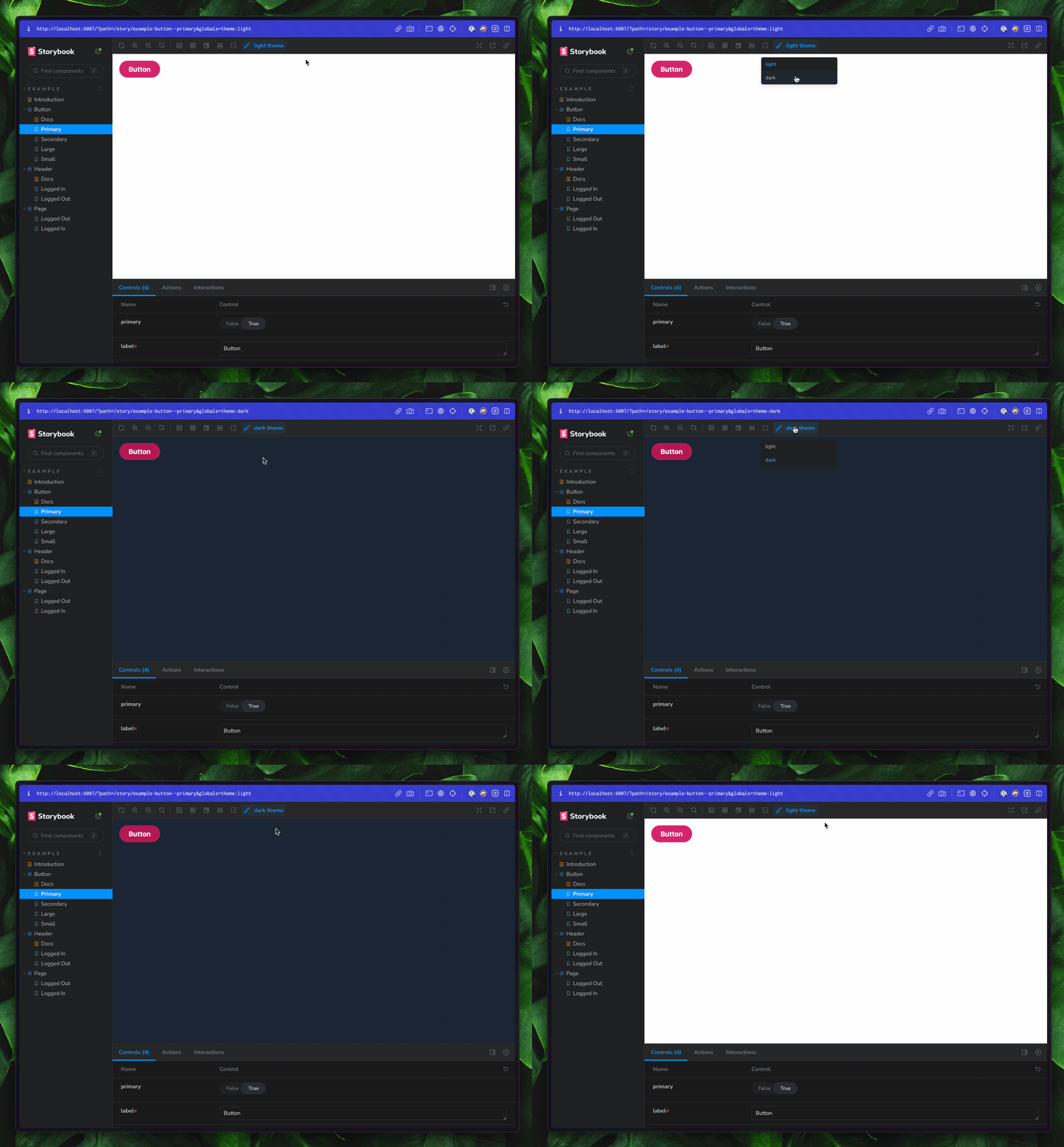
Storybook Addon Themes can be used which between multiple themes for components inside the preview in Storybook.

Usage
Requires Storybook 7.0 or later. If you need to add it to your Storybook, you can run:
npm i -D @storybook/addon-themes
Then, add following content to .storybook/main.js:
export default {
  addons: ['@storybook/addon-themes'],
};
👇 Tool specific configuration
For tool-specific setup, check out the recipes below
Don't see your favorite tool listed? Don't worry! That doesn't mean this addon isn't for you. Check out the "Writing a custom decorator" section of the api reference.
❗️ Overriding theme
If you want to override your theme for a particular component or story, you can use the themes.themeOverride parameter.
import React from 'react';
import { Button } from './Button';

export default {
  title: 'Example/Button',
  component: Button,
  // meta level override
  globals: { theme: 'dark' },
};

export const Primary = {
  args: {
    primary: true,
    label: 'Button',
  },
};

export const PrimaryDark = {
  args: {
    primary: true,
    label: 'Button',
  },
  // story level override
  globals: { theme: 'dark' },
};
Made by
- domyen
- kasperpeulen
- valentinpalkovic
- jreinhold
- kylegach
- ndelangen
Work with
Angular
Ember
HTML
Marko
Mithril
Preact
Rax
React
Riot
Svelte
Vue
Web Components
Tags