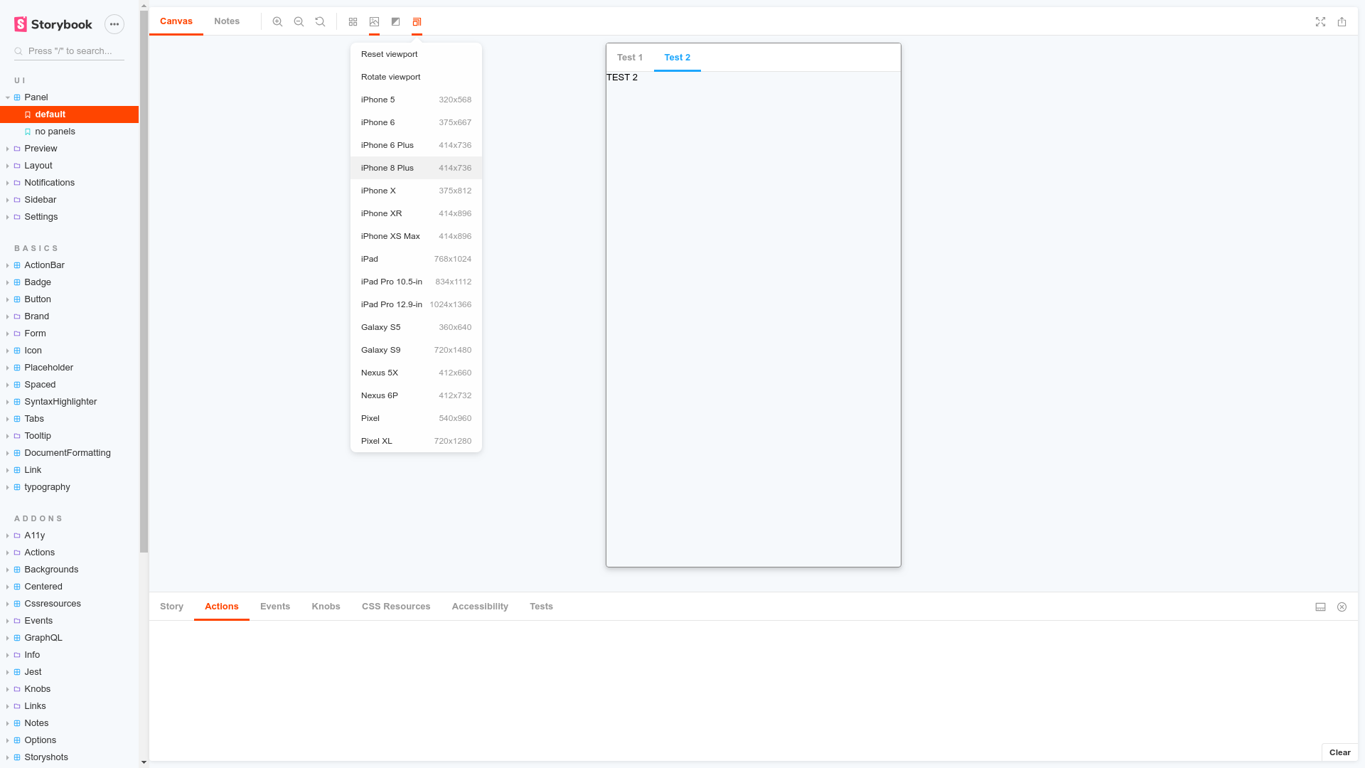
Viewport
Build responsive components by adjusting Storybook’s viewport size and orientation
Storybook Viewport Addon
Storybook Viewport Addon allows your stories to be displayed in different sizes and layouts in Storybook. This helps build responsive components inside of Storybook.

Installation
Viewport is part of essentials and so is installed in all new Storybooks by default. If you need to add it to your Storybook, you can run:
npm i -D @storybook/addon-viewport
Then, add following content to .storybook/main.js:
export default {
  addons: ['@storybook/addon-viewport'],
};
You should now be able to see the viewport addon icon in the toolbar at the top of the screen.
Usage
The usage is documented in the documentation.
Made by
- domyen
- kasperpeulen
- valentinpalkovic
- jreinhold
- kylegach
- ndelangen
Work with
Angular
Ember
HTML
Marko
Mithril
Preact
Rax
React
Riot
Svelte
Vue
Web Components
Tags