Highlight
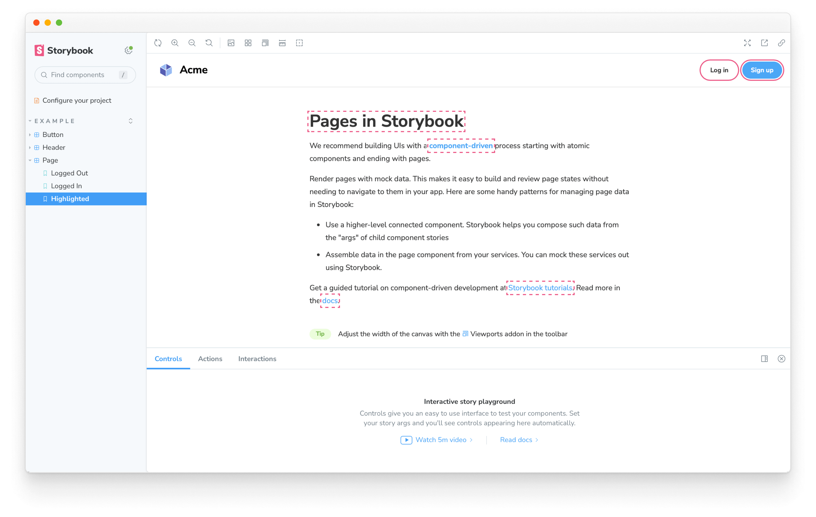
Storybook's Highlight addon is a helpful tool for visually debugging your components, allowing you to highlight specific DOM nodes within your story when used as a standalone addon or enhancing other addons such as the Accessibility addon to inform you of accessibility issues within your components.

Highlighting DOM Elements
To highlight DOM elements with the addon, you'll need to emit the HIGHLIGHT event from within a story or an addon. The event payload must contain an elements property assigned to an array of selectors matching the elements you want to highlight. For example:
import type { Meta, StoryObj } from '@storybook/react';
import { useChannel } from '@storybook/preview-api';
import { HIGHLIGHT } from '@storybook/addon-highlight';

import { MyComponent } from './MyComponent';

const meta: Meta<typeof MyComponent> = {
  component: MyComponent,
};

export default meta;
type Story = StoryObj<typeof MyComponent>;

export const Highlighted: Story = {
  decorators: [
    (storyFn) => {
      const emit = useChannel({});
      emit(HIGHLIGHT, {
        elements: ['h2', 'a', '.storybook-button'],
      });
      return storyFn();
    },
  ],
};We recommend choosing the most specific selector possible to avoid highlighting elements other addons use. This is because the addon tries to match selectors against the entire DOM tree.
Reset highlighted elements
Out of the box, Storybook automatically removes highlighted elements when transitioning between stories. However, if you need to clear them manually, you can emit the RESET_HIGHLIGHT event from within a story or an addon. For example:
import type { Meta, StoryObj } from '@storybook/react';
import { useChannel } from '@storybook/preview-api';
import { HIGHLIGHT, RESET_HIGHLIGHT } from '@storybook/addon-highlight';

import { MyComponent } from './MyComponent';

const meta: Meta<typeof MyComponent> = {
  component: MyComponent,
};

export default meta;
type Story = StoryObj<typeof MyComponent>;

export const ResetHighlight: Story = {
  decorators: [
    (storyFn) => {
      const emit = useChannel({});
      emit(RESET_HIGHLIGHT); //👈 Remove previously highlighted elements
      emit(HIGHLIGHT, {
        elements: ['header', 'section', 'footer'],
      });
      return storyFn();
    },
  ],
};The emit function derived from the useChannel API hook creates a communication channel in Storybook's UI to listen for events and update the UI accordingly. The Highlight addon uses this channel to listen to custom events and update the highlighted elements (if any) accordingly.
Customize style
By default, the addon applies a standard style to the highlighted elements you've enabled for the story. However, you can enable your custom style by extending the payload object and providing a color and/or style properties. For example:
import type { Meta, StoryObj } from '@storybook/react';
import { useChannel } from '@storybook/preview-api';
import { HIGHLIGHT } from '@storybook/addon-highlight';

import { MyComponent } from './MyComponent';

const meta: Meta<typeof MyComponent> = {
  component: MyComponent,
};

export default meta;
type Story = StoryObj<typeof MyComponent>;

export const StyledHighlight: Story = {
  decorators: [
    (storyFn) => {
      const emit = useChannel({});
      emit(HIGHLIGHT, {
        elements: ['h2', 'a', '.storybook-button'],
        color: 'blue',
        style: 'double', // 'dotted' | 'dashed' | 'solid' | 'double'
      });
      return storyFn();
    },
  ],
};
API
Parameters
This addon contributes the following parameters to Storybook, under the highlight namespace:
disable
Type: boolean
Disable this addon's behavior. If you wish to disable this addon for the entire Storybook, you should do so when registering addon-essentials. See the essential addon's docs for more information.
This parameter is most useful to allow overriding at more specific levels. For example, if this parameter is set to true at the project level, it could then be re-enabled by setting it to false at the meta (component) or story level.
Exports
This addon contributes the following exports to Storybook:
import { HIGHLIGHT, RESET_HIGHLIGHT } from '@storybook/addon-highlight';HIGHLIGHT
Type: string
An event that highlights DOM elements. The event payload must contain an elements property assigned to an array of selectors matching the elements you want to highlight. See the usage example, above.
RESET_HIGHLIGHT
Type: string
An event to clear all highlights from highlighted elements. See the usage example, above.
