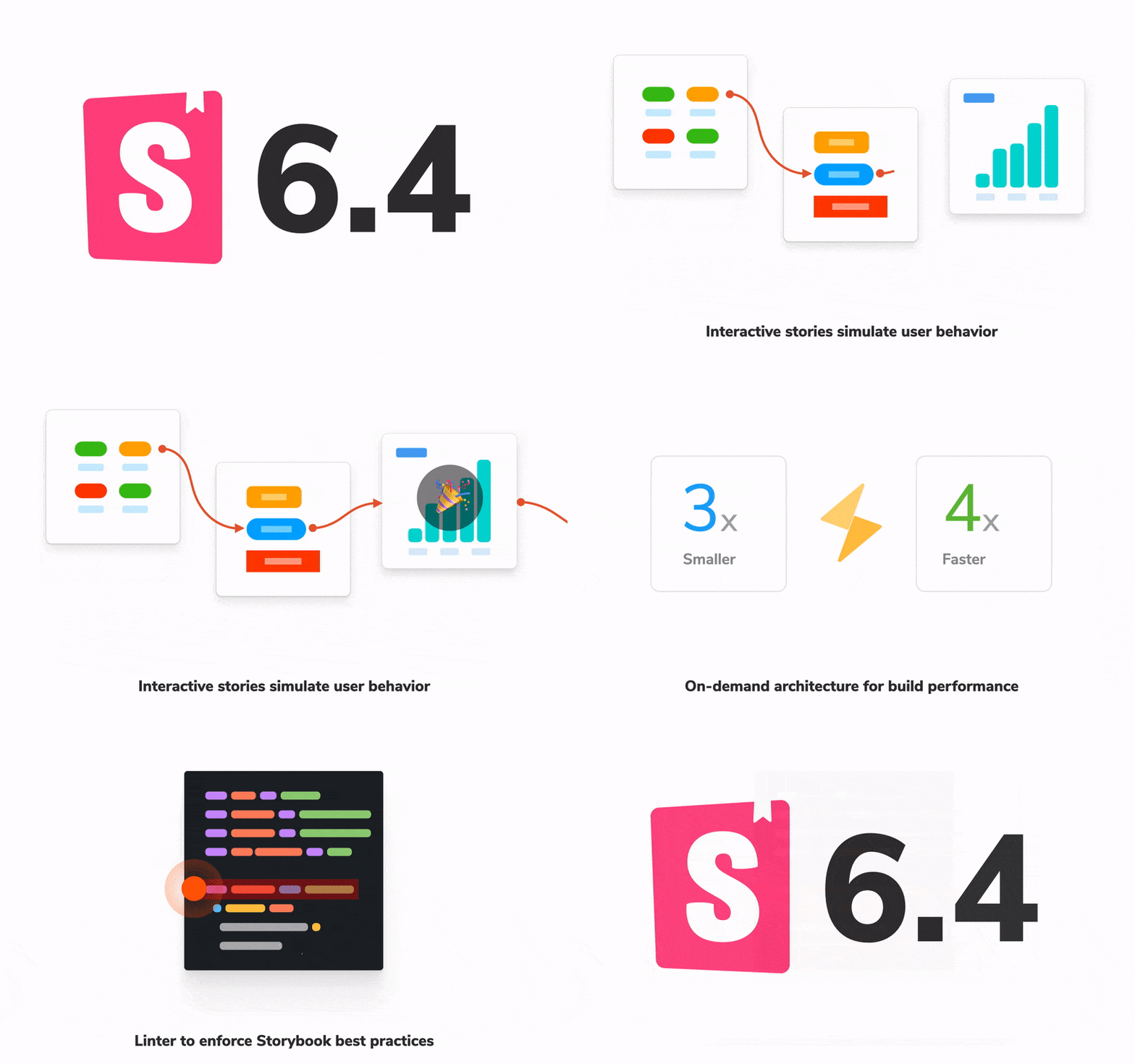
Storybook 6.4
Smaller, faster, and interactive

Storybook is the leading UI development workshop for components and pages. Over the past five years, it's grown from niche tool to standard fixture in frontend that's used by teams at Twitter, Github, BBC, and the New York Times.
As Storybook's user base has grown, so have its use cases. Early adopters used Storybook to develop components for design systems and libraries. Now, teams use it to build, test, and document all kinds of complex connected components—even entire application pages!
Building UI in isolation helps you stress test and find edge cases. But isolating complex components presents new challenges because they often manage their own state and/or load data from external sources.
Storybook 6.4 makes it easier to build connected components and pages:
- ▶️ Interactive stories to simulate user behavior and tools to debug it
- ⚡️ On-demand architecture for 3x smaller builds and faster load times
- ⛸ Automigrate + versioned documentation for easier upgrades
- 📋 Linter to enforce Storybook best practices
- 💯 Hundreds more fixes and quality of life improvements
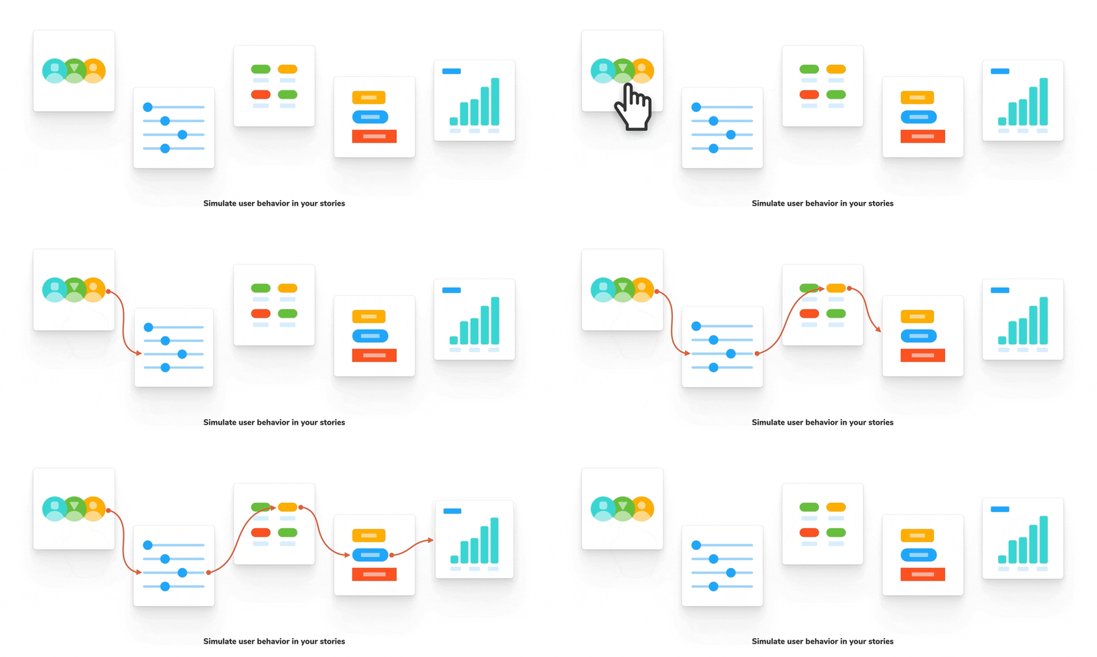
Interactive stories
Storybook enables you to capture various states of a component in a structured format called a story. Each story simulates a particular UI state by rendering the component in isolation and supplying props and mock data.
However, some UI states can only be reached via user interaction—click, drag, tap, type, etc. These were previously impossible to model in Storybook. To address this, we've added a new construct in Storybook 6.4 called the play function. That enables you to run scripted interactions after a story is rendered.
Consider this play function that fills out a form to trigger a validation:
// AccountForm.stories.js
import { within, userEvent } from '@storybook/testing-library';
import { AccountForm } from './AccountForm';

export default { component: AccountForm };

export const VerificationSuccess = {
  args: { passwordVerification: true },
  play: async ({ canvasElement }) => {
    const canvas = within(canvasElement);
    await userEvent.type(canvas.getByTestId('email'), 'michael@chromatic.com');
    await userEvent.type(canvas.getByTestId('password1'), 'k32904n£#1kjad', { delay: 50 });
    await userEvent.type(canvas.getByTestId('password2'), 'k32904n£#1kjad', { delay: 50 });
    await userEvent.click(canvas.getByTestId('submit'));
  },
};
Play functions unlock new ways of capturing component use cases and introduce a few unique challenges. For instance, if an interaction fails, is it a bug in your component or does the play function need to be updated?
To help debug such situations, we're introducing an experimental new addon Storybook Interactions. When installed, it visualizes every step of the play function:
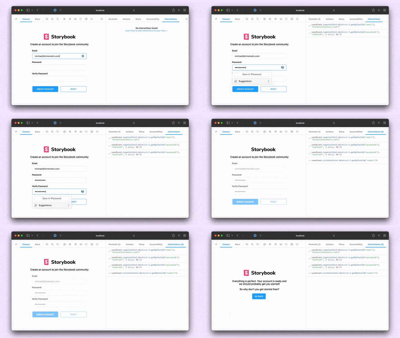
This is just the tip of the iceberg. We've also created a Storybook linter to help you write well-formed stories and play functions. To learn more, check out the Interactive stories announcement.

On-demand architecture
When you write stories, you compile component examples, guidelines and APIs all in one place. Teams publish stories online to make reviews and collaboration easier.
Storybooks have more stories than ever. It's now common to see projects with hundreds of components and thousands of stories. But our original build process wasn't optimized for that scale, which led to slower load times.
We partnered with Webpack and Shopify UX engineering teams to create a new on-demand architecture. It's a fundamental change that enables 3x smaller bundles and 4x faster load times for static builds.
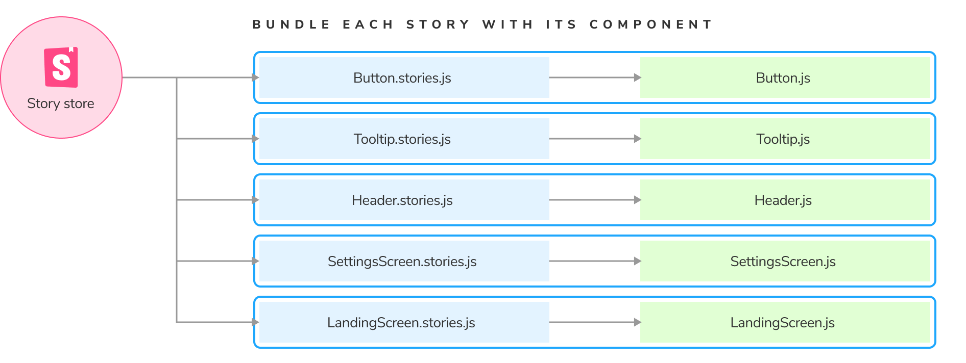
How? This performance leap is achieved by reworking Storybook core to load each story independently rather than packing them into a single monolithic bundle.
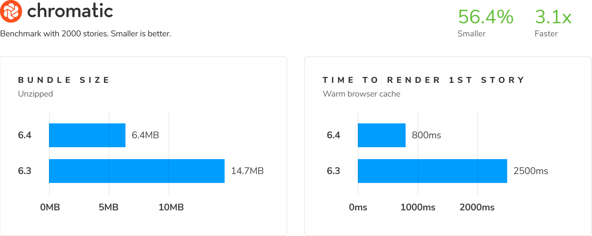
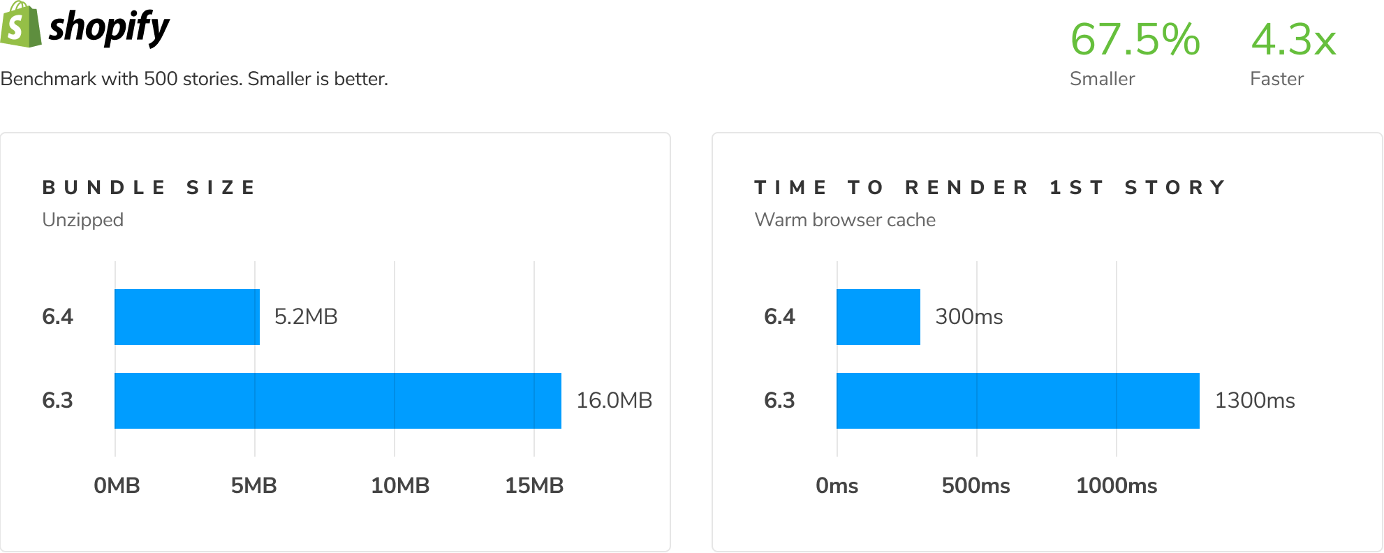
The new core has more robust tests than its predecessor which makes it a solid foundation for the future of Storybook! What's more, it sets us up for further performance optimizations such as file-based caching and lazy compilation.
To learn more, read the on-demand architecture announcement.
Streamlined tooling and docs
Storybook is a fast-moving project. It can be hard to keep up with all the changes while also doing your day job. That's why we're streamlining our tooling and documentation to make upgrades effortless.
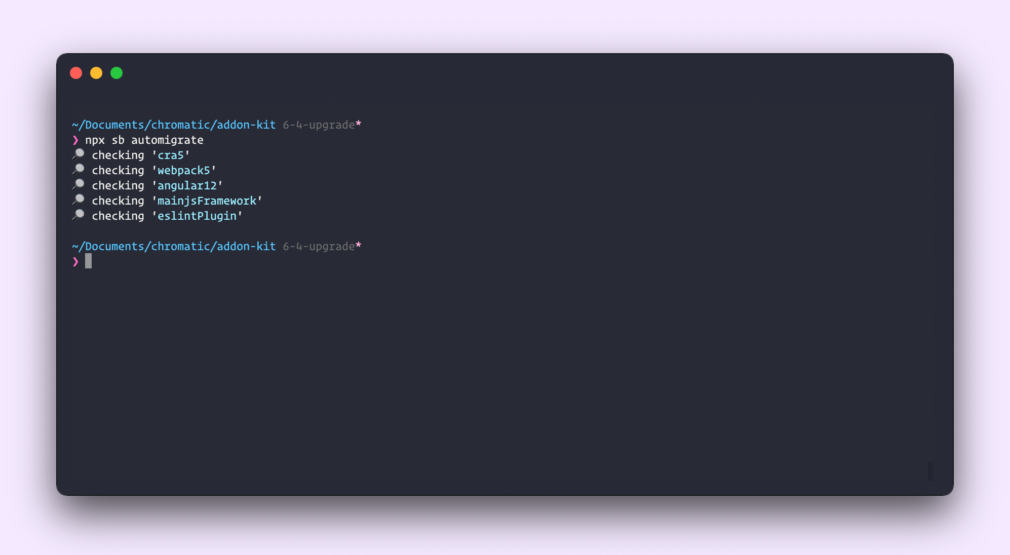
Automigrate gives you superpowers to automatically update your Storybook to the latest recommended practices. For example, are you using Webpack5, but your Storybook is still on Webpack4? Run npx sb automigrate, and it'll check for upgrade paths, explain what it's found, and offer you the option to automatically update dependencies, configuration, and code. Starting in 6.4, automigrate will run as part of the upgrade process.
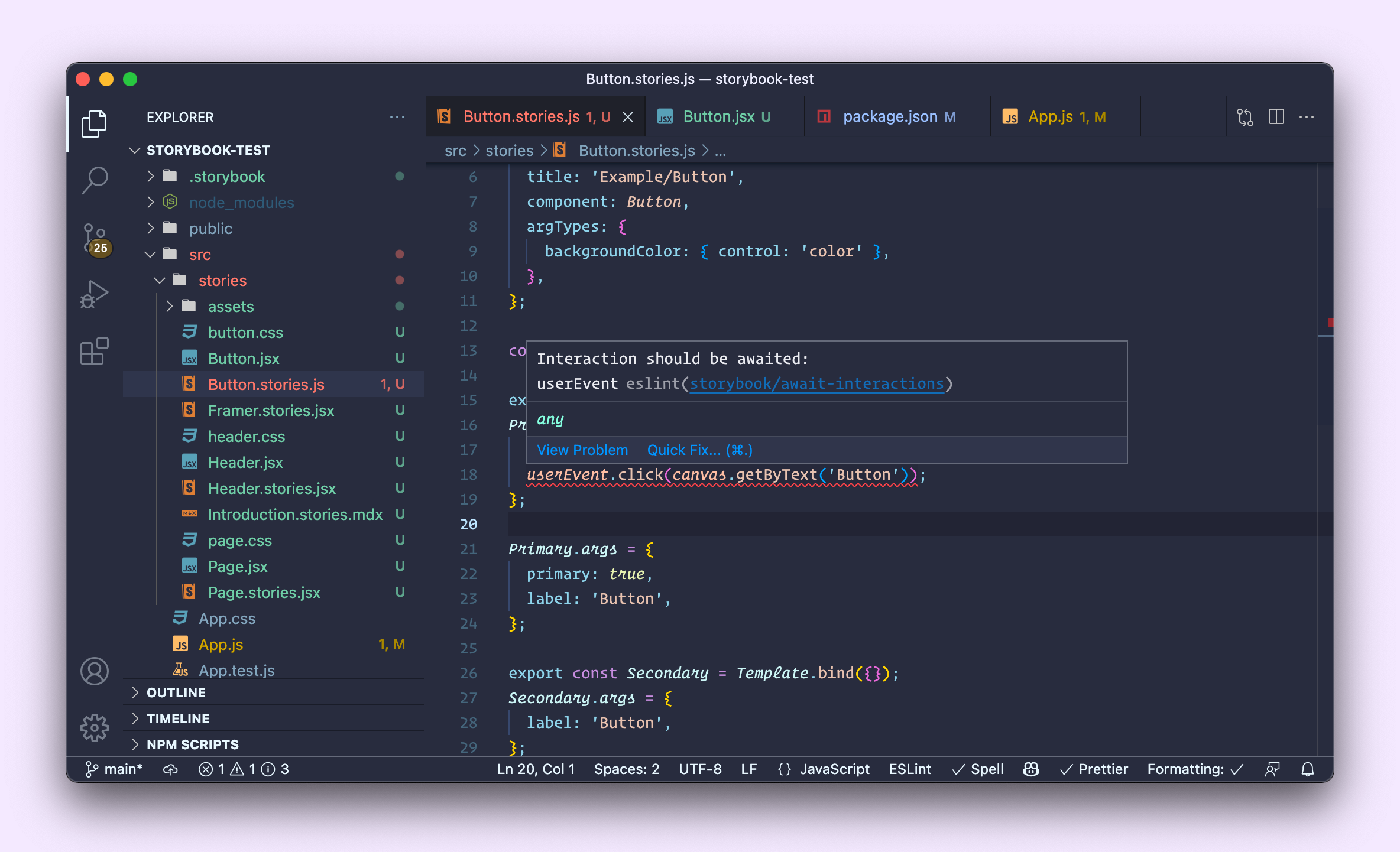
Linter helps ensure your stories are well-formed and that they're using up-to-date syntax. This new helper tool was developed by Yann Braga and Michael Shilman (me!). If you're already using ESlint, the Storybook linter will be automatically installed when you upgrade to 6.4.
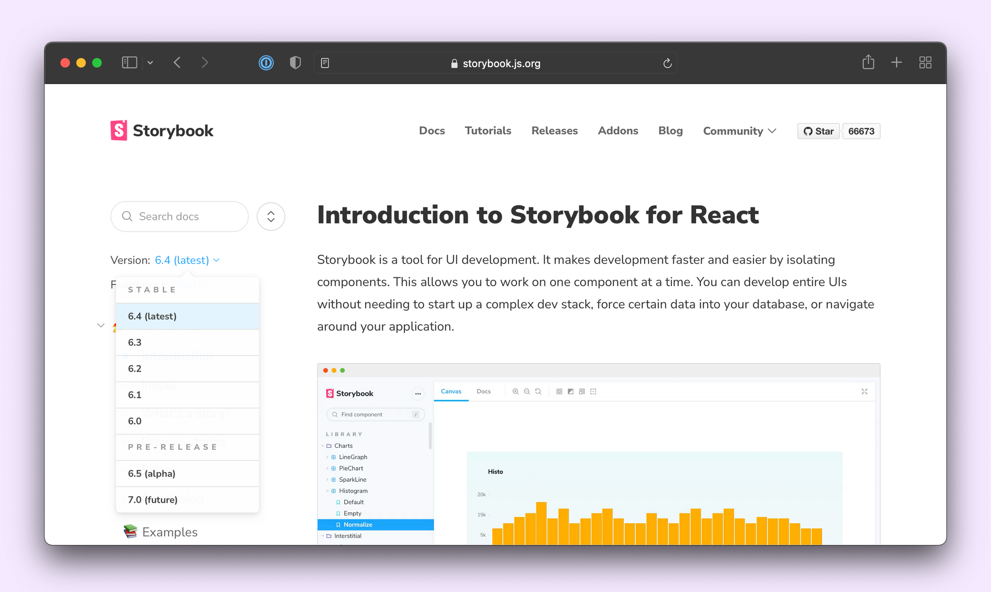
Versioned docs are now available! Unable to upgrade? You can access older versions as far back as 6.0. Want to try out experimental features before they are stable? WIP docs for 7.0 are now just a click away. This massive quality of life improvement is brought to you by Kyle Gach and João Cardoso.
Feature flags unlock experimental or breaking features available to those that need them right away, without disrupting everybody else. For example, a lot of you have been challenged by Storybook's dependence on Emotion 10. You can now unpin the emotion dependency with the emotionAlias feature flag:
module.exports = {
  features: { emotionAlias: false }
}
For a complete list of feature flags, please refer to our type definitions.
With a large surface area and a fast-moving development cadence, we realize that there's much more to do here. But we hope that this can make your 6.4 upgrade much more manageable than previous releases. We will continue to hammer on this area of Storybook until we've... nailed it. 🥁

Framework improvements
Storybook supports every major web front-end framework, and with each release, we try to improve framework support. Storybook 6.4 contains the following framework improvements:
React: We've upgraded from reach-router to react-router 6, thanks to Norbert de Langen. This fixes npm7 errors related to React 17 projects.
Angular: Angular 13 is now supported thanks to heroic work by Thibaud Avenier, Stefanos Lignos, and Juri Strumpflohner in collaboration with the Nx team.
Web-components: Lots of documentation improvements. Including dynamically-generated source snippets for HTML and web-components by Chris Garrett and Benny Powers and custom elements manifest ArgsTable support by Pascal Schilp.
React Native (RN): Storybook for RN maintainer Danny Williams brings us a new way to develop and document RN components. Our traditional RN support rendered your components on a native device. This new package uses React Native Web to render them in the browser for easier sharing. Plus, it offers compatibility with the latest version of Storybook and its full suite of addons and tooling.
Hundreds more improvements
Storybook continues to improve at every level. 6.4 contains hundreds more fixes, features, and tweaks. Browse the changelogs matching 6.4.0-* for the full list of changes. Highlights include:
- ✅ Better UI for sidebar toggle by Angeliki Papadopoulou
- ✅ Skip to canvas sidebar links for a11y by Deen Denno
- ✅ Globals URL parameter by Gert Hengeveld
- ✅ Opt out of safe-eval for Content Security Policy compliance by Norbert de Langen
- ✅ Automatically build & update
stories.jsonfor easier composition by Michael Shilman - ✅ Automatically generate component titles based on file path by Michael Shilman
1 minute install
Upgrade an existing Storybook project to 6.4:
npx sb@latest upgrade
If you’re coming from 5.x or earlier, check out the Storybook 6 Migration Guide.
Alternatively, for a fresh install, bootstrap Storybook into an existing app:
npx sb@latest init
Get involved
Professional UI developers rely on Storybook every day. When you adopt Storybook, you get a suite of tools, powerful addons, and out-of-the-box integrations that make development faster.
The project is maintained by 1,400+ open source contributors and guided by a steering committee. If you are interested in contributing, check out Storybook on GitHub, create an issue, or submit a pull request. Donate on Open Collective. Chat with us in Discord — a maintainer is usually online. Stay up to date with Storybook news on Twitter and by signing up for our mailing list.
Storybook 6.4 is out!
— Storybook (@storybookjs) December 1, 2021
New features, perf gains & improved ergonomics
▶️ Interactive stories to simulate user behavior
⚡️ On-demand architecture speeds up load times
⛸ Automigrate + versioned docs for easier upgrades
📋 Linter to enforce best practiceshttps://t.co/GE8xWMbf6v pic.twitter.com/DNnqA8P7Ej