Create Storybook Addon
Launching an Addon Kit and in-depth guide

Every team delivers UI differently. There are infinite workflows that vary from tools to tech stack to testing strategy. Storybook is super flexible, which means that you can adapt it to any process.
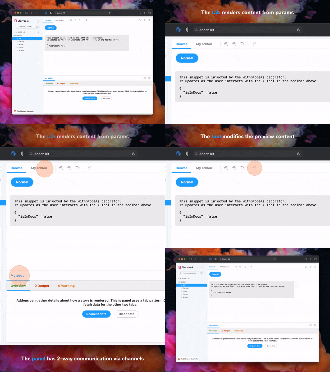
Addons are a convenient way to customize Storybook to fit your workflow. The community uses addons to automate tedious jobs, integrate libraries, and invent new ways to collaborate. We created an Addon Kit and in-depth guide to help you build an addon for yourself.
Why build an addon?
Storybook's extensible architecture provides a foundation to build custom workflows. You can scratch your own itch to improve an awkward integration. Or automate cumbersome tasks that everyone hates doing. Let's look at a few examples.
- Figma addon (400k npm downloads a month) by Shota Fuji embeds designs alongside component implementation. It made UI buildouts faster and allowed his digital agency to ship more work.
- Storybook Mobile by Alex Holachek evaluates components against mobile web best practices. It’s the first mobile linter of its kind.
- HTML addon by Whitespace displays the compiled HTML for each story, giving back-end devs easy access to shared UIs.
- Atlassian built the Performance addon to debug performance issues in React components.
Getting started
So you’ve got some ideas brewing and want to build your own addon? We gathered a bunch of useful resources to help you get started:
- Addon API Documentation offers guides, code samples and, of course, an API reference.
- Create an Addon Guide is a comprehensive and hands-on tutorial that takes you through building the Outline addon.
- Addon Kit offers a boilerplate to get you up and running quickly.
You can also explore open source addons such as Pseudo States, Dark Mode and the other official addons. They’re real world examples for you to learn from.
Storybook Addon Kit

It's frustrating to spend time bootstrapping a project when all you want to do is start coding. We hear you. Dive into building your addon without dealing with configurations, so we put together an Addon Kit. It offers everything you need to get started:
- 📝 Live-editing in development mode
- ⚛️ React/JSX support for the UI
- 📦 Transpiling and bundling with Babel
- 🏷 Plugin metadata
- 🚢 Release management with Auto
Use it to bootstrap a new addon instantly!
Create an Addon Guide

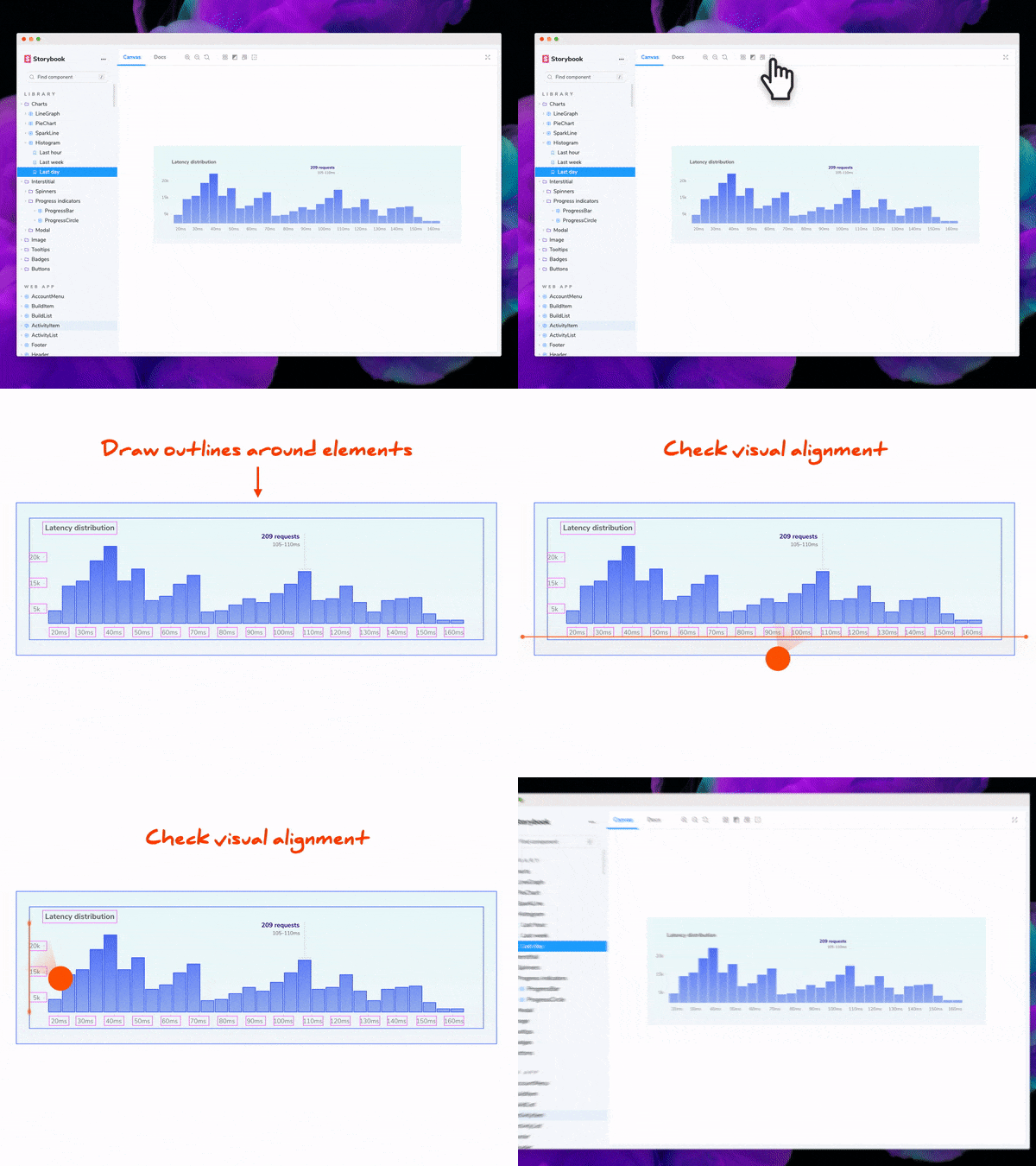
I’ve put together an in-depth guide that shows you how to create an addon. Follow along as we code the Outline addon—used for visually debugging CSS layout and alignment. It adds a toolbar button that outlines all UI elements, making it easy to verify positioning and placement at a glance.

Along the way you’ll learn about the inner workings of Storybook and the addon API, and publish your first addon.
Conclusion
Storybook’s extensible architecture allows you to customize it, automate workflows, and integrate with your favourite tools. Addons play a key role in this. In fact, most of Storybook’s core features are implemented as addons. For instance: documentation, accessibility testing and interactive controls, among others.
Storybook’s addon API provides utilities and helpers to build your addon fast. What’s more, you can share those addons with thousands of developers via the addon catalog.
Now, get started and we can’t wait to see what you create!