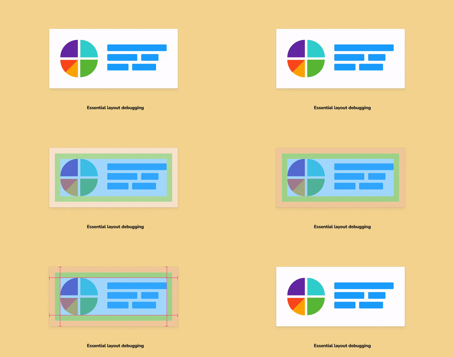
Essential layout debugging
Storybook addons to make layout debugging a snap

As front-end developers, we spend a lot of our time building layouts with CSS. Which means constantly having to cross-check coded components with design specs. Making sure we picked the right margin and padding values. Or ensuring that items are positioned correctly.
Browser devtools are great at debugging the box model but are clunky when you want to spot-check spacing and alignment. You have to jump between multiple tabs to dig out that information.
Storybook 6.3 introduces a new set of addons that combine the power of browser devtools with the ergonomics of design tools. You can easily measure distances and verify dimensions & positioning. They also make layout debugging accessible to folks who aren't developers.
Read on to learn more about the Measure and Outline addons. And how you can use them to speed up your UI development workflow.
Spacing
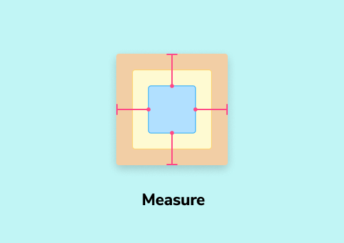
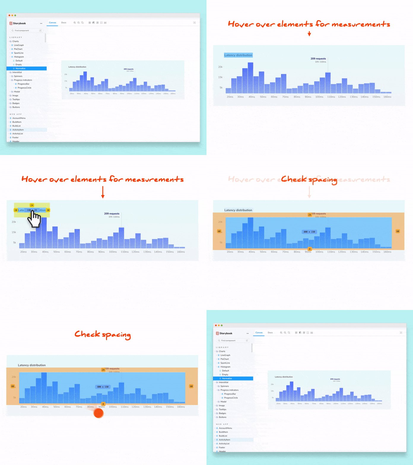
You can’t just eyeball the distance between two elements. You need some way to measure it. In design tools like Figma and Sketch, you can hold down the option key to measure distances between layers. The information is overlaid right on top of the UI you are evaluating. So, you can check spacing with just a glance. Much faster than clicking around in dev-tools!
The Measure addon brings this familiar functionality to Storybook.
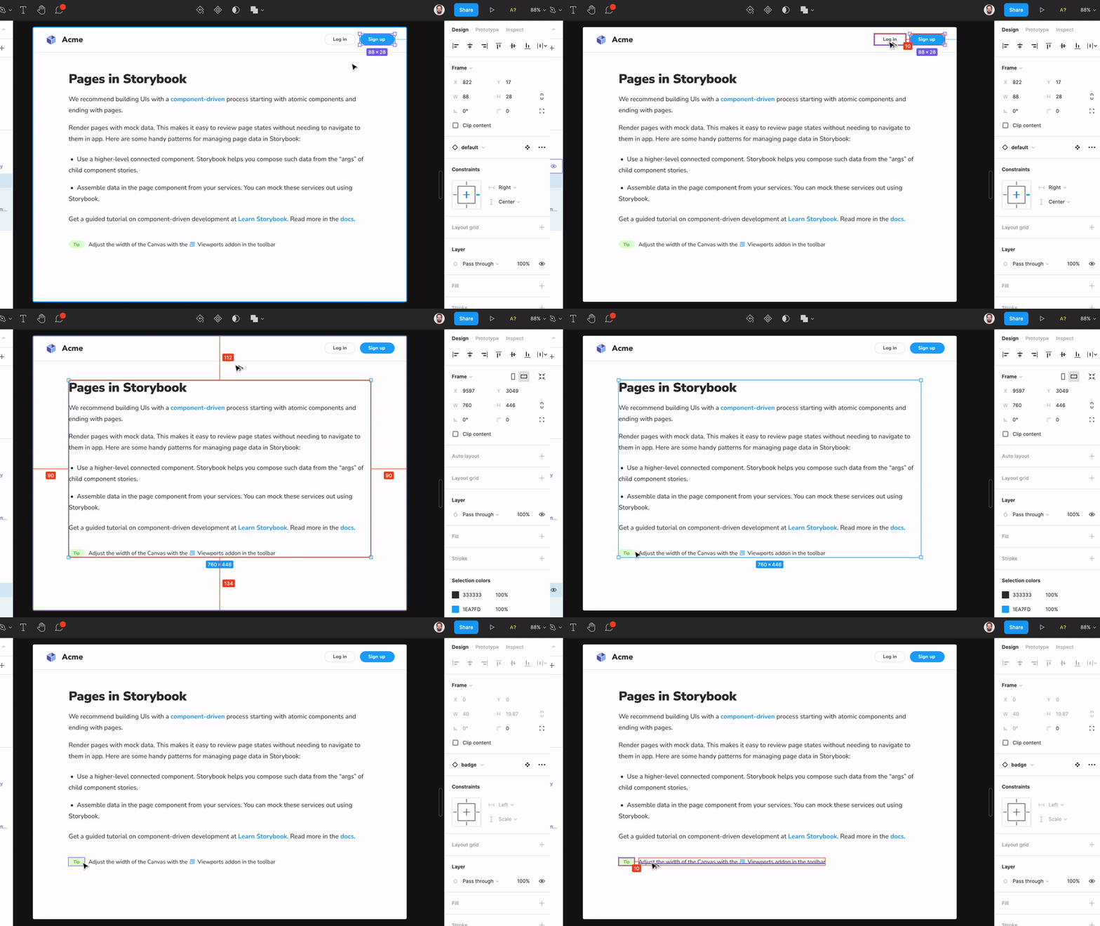
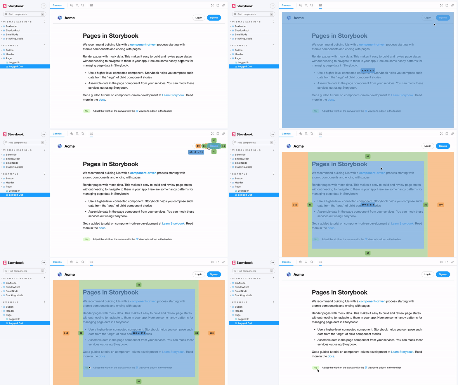
Whitespace in CSS is slightly more complex. It’s a combination of margin, padding and border. Therefore, Storybook will visualize the box model and display the dimensions of the chosen DOM node.
Enable the addon from the toolbar or by pressing the m key and hover over the element you want to inspect.
Alignment
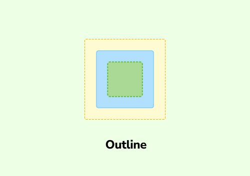
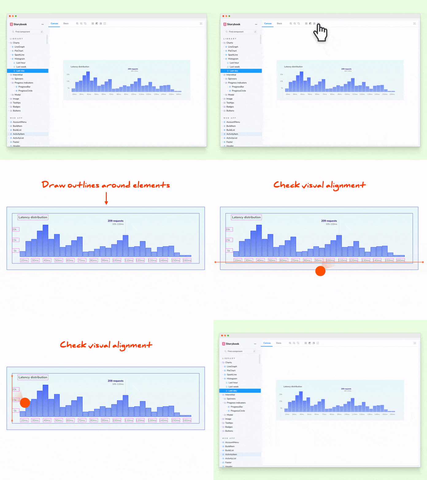
Checking visual alignment is another crucial aspect of building layouts. It gets especially tricky when DOM elements are far apart or have odd shapes. Pesticide pioneered the technique of outlining every UI element on the page. These outlines act as a guide making it much easier to verify positioning.
The Outline addon allows you to toggle outlines on all UI elements with just one click. You can spot bugs and broken layouts instantly!
Get it now
The Measure and Outline addons are part of the essential kit and are now available in the Storybook 6.3 beta. Install it by running the following command at the root of your project.
npx sb@next initTo upgrade an existing project:
npx sb upgrade --prereleaseAnd update your Storybook configuration (.storybook/main.js) to include the essentials addon.
module.exports = {
  addons: ['@storybook/addon-essentials'],
};
Get involved
Storybook's essential layout addons make it easier to build to spec. Developers can get the margin, padding, and dimensions of DOM elements with just one click. Designers can verify layouts without having to rely on devtools.
Professional UI developers rely on Storybook every day. The project is maintained by 1,300+ open source contributors and guided by a steering committee of top maintainers. If you are interested in contributing, check out Storybook on GitHub, create an issue, submit a pull request or build an addon. Donate on Open Collective. Chat with us in Discord — a maintainer is usually online. Stay up to date with Storybook news on Twitter and by signing up for our mailing list.