Build UI components
In chapter 3, we’ll set up the essential design system tooling starting with Storybook, the most popular component explorer. The goal of this guide is to show you how professional teams build design systems, so we’ll also focus on finer details like the code hygiene, timesaving Storybook addons, and directory structure.

Code formatting and linting for hygiene
Design systems are collaborative, so tools that fix syntax and standardize formatting serve to improve contribution quality. Enforcing code consistency with tooling is much less work than policing code by hand, a benefit for the resourceful design system author.
In this tutorial, we'll use VSCode as our editor, but you can apply the same principles to other modern editors like Atom, Sublime, or IntelliJ.
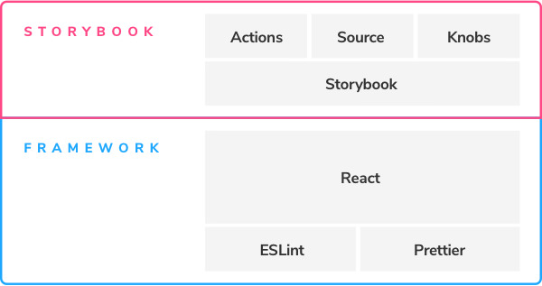
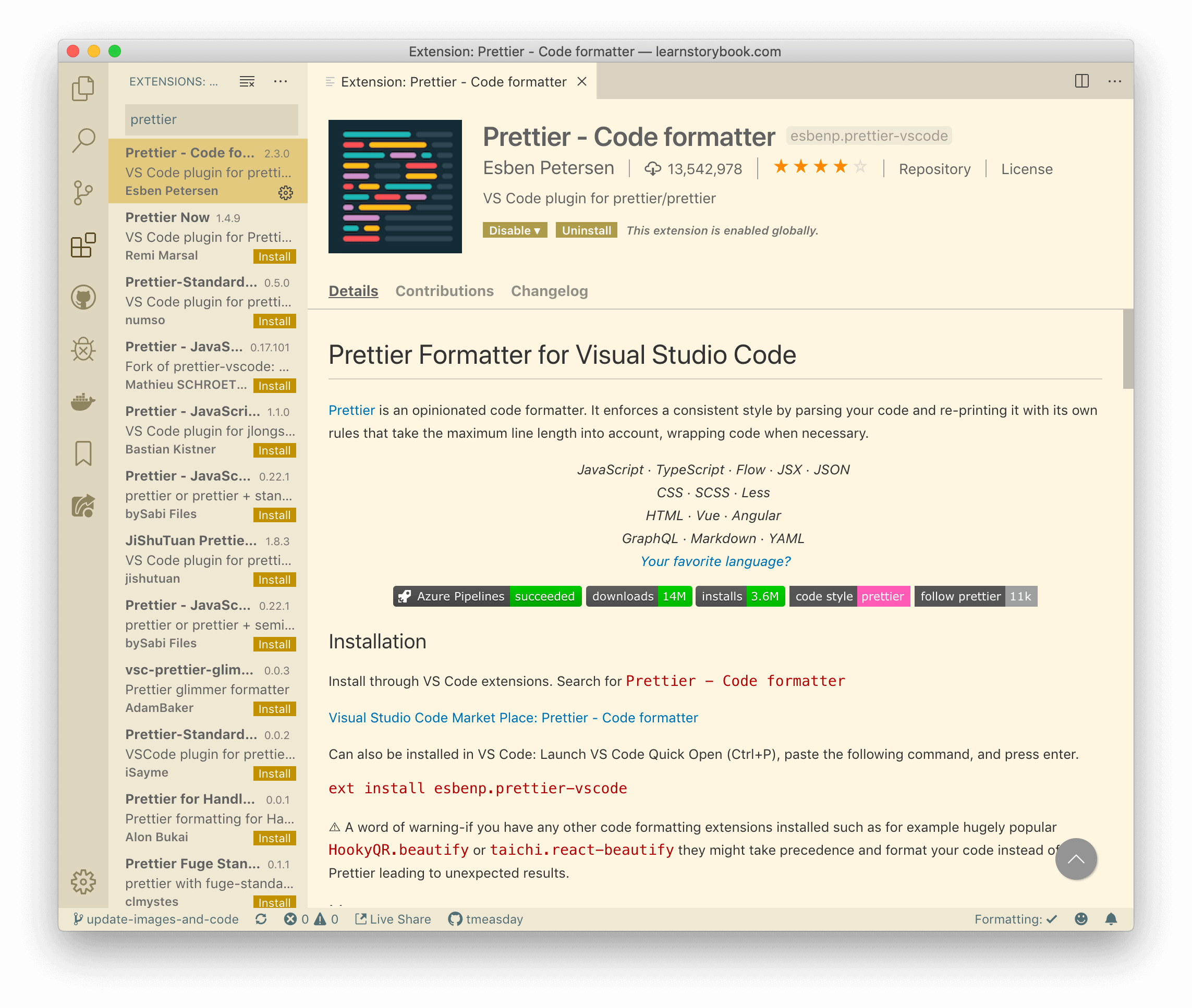
To ensure a consistent code style, we will be utilizing Prettier. This code formatter is widely used and supports multiple languages. It seamlessly integrates with most editors, including the one we are using, and was included in the template we cloned earlier in this guide when we initialized our design system. If you are a first-time user of Prettier, you may need to configure it for your editor. For VSCode, install the Prettier addon.

Enable the Format on Save editor.formatOnSave if you haven’t done so already. Once you’ve installed Prettier, you should find that it auto-formats your code whenever you save a file.
Install Storybook
Storybook is the industry-standard component explorer for developing UI components in isolation. Since design systems focus on UI components, Storybook is the ideal tool for the use case. We’ll rely on these features:
- 📕Catalog UI components
- 📄Save component variations as stories
- ⚡️Developer experience tooling like Hot Module Reloading
- 🛠Supports many view layers, including React
Install and run Storybook with the following commands:
# Installs Storybook
npx storybook@latest init

# Starts Storybook in development mode
yarn storybook
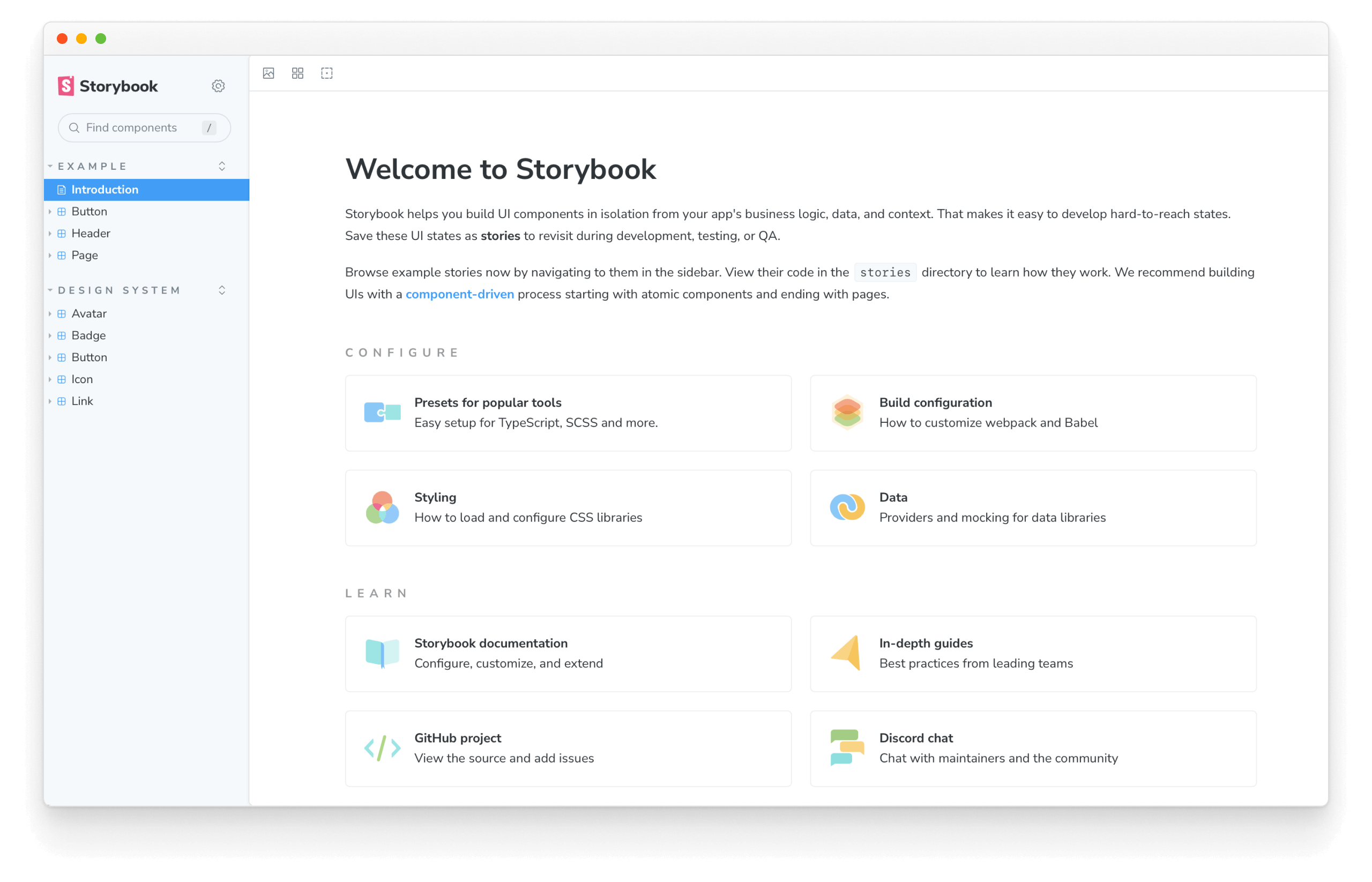
You should see this:

Nice, we’ve set up a component explorer!
Every time you install Storybook into an application, it will add some examples inside the stories folder. If you want, take some time and explore them. But we won't be needing them for our design system, so it's safe to delete the stories directory.
Now your Storybook should look like this (notice that the font styles are a little off, for instance, see the "Avatar: Initials" story):
Add global styles
Our design system requires some global styles (a CSS reset) to be applied to the document to render our components correctly. We can add them easily with Emotion's global style prop. Update your src/shared/global.js file to the following:
import { css } from '@emotion/react';

import { color, typography } from './styles';

+ export const fontUrl = 'https://fonts.googleapis.com/css?family=Nunito+Sans:400,700,800,900';

export const bodyStyles = css`
  /* Same as before */
`;

export const GlobalStyle = css`
  body {
    ${bodyStyles}
  }
`;
To use the Global “component” in Storybook, we can make use of a decorator (a component wrapper). In an app, we’d place that component in the top-level app layout, but in Storybook, we wrap all stories using the preview config file .storybook/preview.js. Rename the file to .storybook/preview.jsx and update it to the following:
+ import { Global } from '@emotion/react';

+ import { GlobalStyle } from '../src/shared/global';

/** @type { import('@storybook/react').Preview } */
const preview = {
+ decorators: [
+   (Story) => (
+     <>
+       <Global styles={GlobalStyle} />
+       <Story />
+     </>
+   ),
+ ],
  parameters: {
    actions: { argTypesRegex: '^on[A-Z].*' },
    controls: {
      matchers: {
        color: /(background|color)$/i,
        date: /Date$/,
      },
    },
  },
};

export default preview;
<> in the decorator is not a typo--it’s a React Fragment that we use here to avoid adding an unnecessary extra HTML tag to our output.The decorator ensures the GlobalStyle renders no matter which story is selected.

Supercharge Storybook with addons
Storybook includes a powerful addon ecosystem created by a massive community. For the pragmatic developer, it’s easier to build our workflow using the ecosystem instead of creating custom tooling ourselves (which can be time-consuming).
Actions addon to verify interactivity
The actions addon gives you UI feedback in Storybook when an action is performed on an interactive element like a Button or Link. Actions comes installed in Storybook by default, and you use it simply by passing an “action” as a callback prop to a component.
Let’s see how to use it in our Button element, which optionally takes a wrapper component to respond to clicks. We have a story that passes an action to that wrapper:
import styled from '@emotion/styled';

import { Button } from './Button';

import { Icon } from '../Icon/Icon';

import { StoryLinkWrapper } from '../LinkWrapper';

// When the user clicks a button, it will trigger the `action()`,
// ultimately showing up in Storybook's addon panel.
function ButtonWrapper(props) {
  return <CustomButton {...props} />;
}

export const buttonWrapper = {
  name: 'button wrapper',
  render: () => (
    <div>
      <ButtonWrapper>Original Button Wrapper</ButtonWrapper>
      <br />
      <Button ButtonWrapper={ButtonWrapper} appearance='primary'>
        Primary
      </Button>
      /* Removed for brevity */
    </div>
  ),
};
Controls to stress test components
Fresh installs of Storybook include the Controls addon already configured out of the box.
It allows you to interact with component inputs (props) dynamically in the Storybook UI. You can supply multiple values to a component prop through arguments (or args for short) and adjust them through the UI. It helps design systems creators stress test component inputs (props) by adjusting the argument's values. It also gives design systems consumers the ability to try components before integrating them to understand how each input (prop) affects them.
Let's see how they work by adding a new story in the Avatar component, located in src/Avatar/Avatar.stories.jsx:
import { Avatar } from './Avatar';

export default {
  title: 'Design System/Avatar',
  component: Avatar,
  /*
   * More on Storybook argTypes at:
   * https://storybook.js.org/docs/react/api/argtypes
   */
  argTypes: {
    size: {
      control: {
        type: 'select',
      },
      options: ['tiny', 'small', 'medium', 'large'],
    },
  },
};

// Other Avatar stories

/*
 * New story using Controls
 * Read more about Storybook templates at:
 * https://storybook.js.org/docs/react/writing-stories/introduction#using-args
 */
export const Controls = {
  args: {
    loading: false,
    size: 'tiny',
    username: 'Dominic Nguyen',
    src: 'https://avatars.githubusercontent.com/u/263385',
  },
};
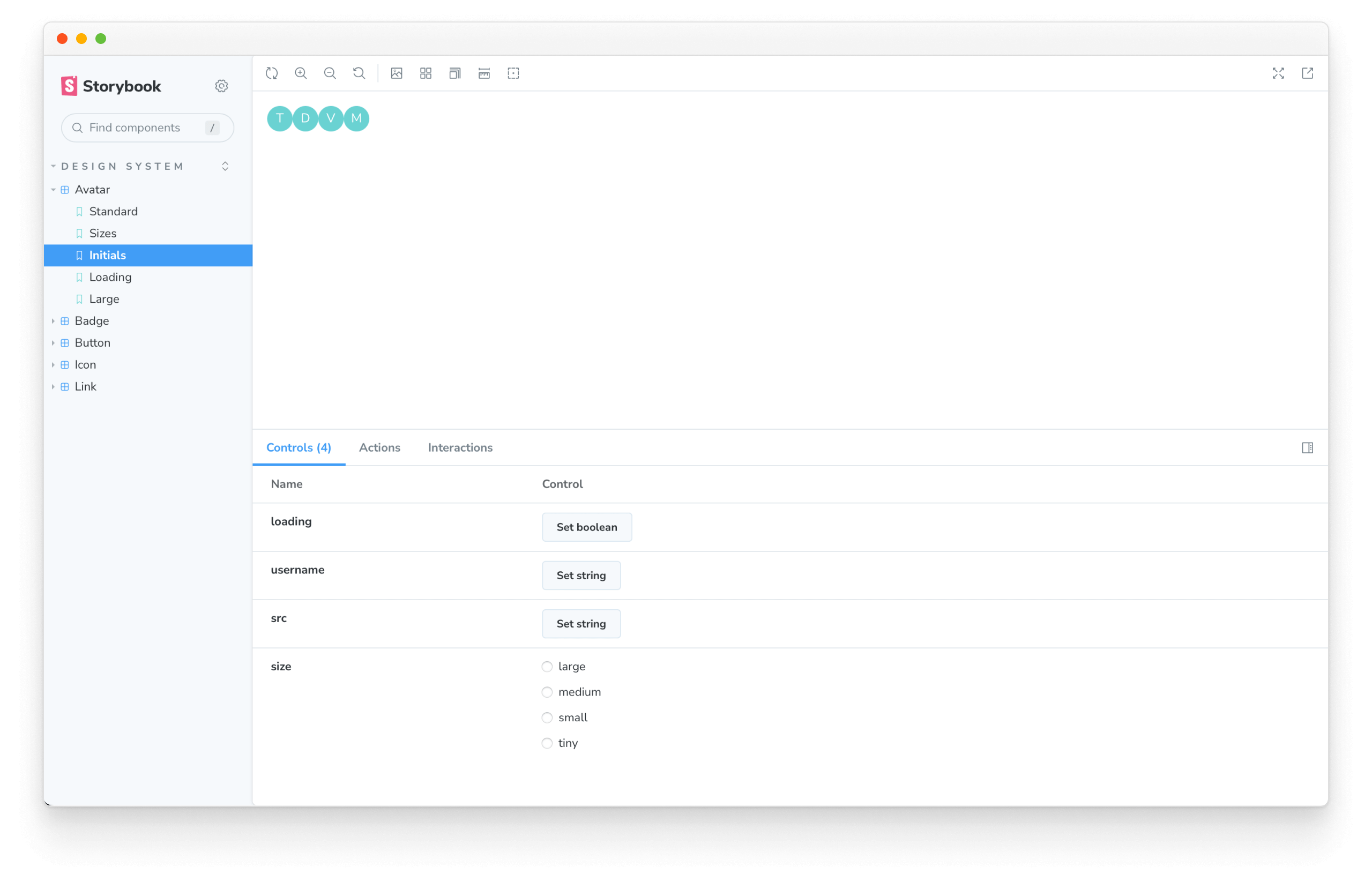
Notice the Controls tab in the addon panel. Controls automatically generates graphical UI to adjust props. For instance, the “size” select element allows us to cycle through the supported Avatar sizes tiny, small, medium, and large. The same was applied to the remainder component's props (“loading”, “username”, and “src”), allowing us to create a user-friendly way to stress test components.
That said, Controls don’t replace stories. They are great for exploring the edge cases of the components and stories for showcasing the assumed states.
We'll visit the Accessibility and Docs addons in later chapters.
“Storybook is a powerful frontend workshop environment tool that allows teams to design, build, and organize UI components (and even full screens!) without getting tripped up over business logic and plumbing.” – Brad Frost, Author of Atomic Design
Learn how to automate maintenance
Now that our design system components are in Storybook, we've taken one more step to create an industry-standard design system. Now it's an excellent time to commit our work to our remote repository. Then we can start thinking about how we set up the automated tooling that streamlines ongoing maintenance.
A design system, like all software, should evolve. The challenge is to ensure UI components continue to look and feel as intended as the design system grows.
In chapter 4, we’ll learn how to set up continuous integration and auto-publish the design system online for collaboration.