Build a simple component
We’ll build our UI following a Component-Driven Development (CDD) methodology. It’s a process that builds UIs from the “bottom-up”, starting with components and ending with screens. CDD helps you scale the amount of complexity you’re faced with as you build out the UI.
Task

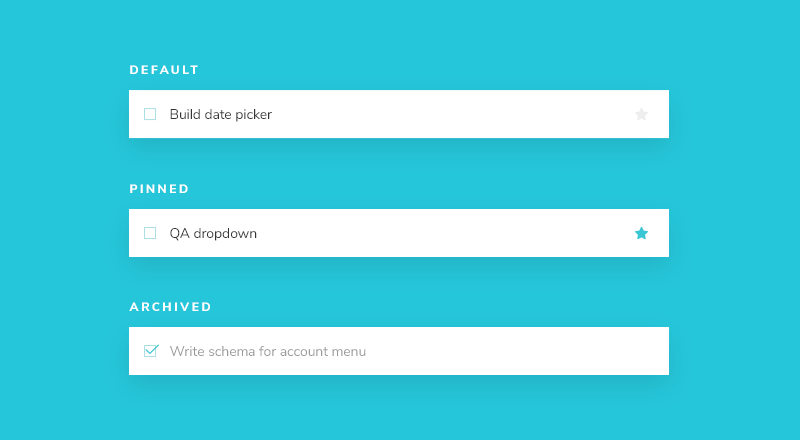
Task is the core component of our app. Each task displays slightly differently depending on exactly what state it’s in. We display a checked (or unchecked) checkbox, some information about the task, and a “pin” button, allowing us to move tasks up and down the list. Putting this together, we’ll need these props:
title– a string describing the taskstate- which list is the task currently in, and is it checked off?
As we start to build Task, we first write our test states that correspond to the different types of tasks sketched above. Then we use Storybook to create the component in isolation using mocked data. We’ll manually test the component’s appearance given each state as we go.
Get set up
First, let’s create the task component and its accompanying story file: src/components/Task.jsx and src/components/Task.stories.jsx.
We’ll begin with a baseline implementation of the Task, simply taking in the attributes we know we’ll need and the two actions you can take on a task (to move it between lists):
export default function Task({ task: { id, title, state }, onArchiveTask, onPinTask }) {
  return (
    <div className="list-item">
      <label htmlFor={`title-${id}`} aria-label={title}>
        <input type="text" value={title} readOnly={true} name="title" id={`title-${id}`} />
      </label>
    </div>
  );
}
Above, we render straightforward markup for Task based on the existing HTML structure of the Todos application.
Below we build out Task’s three test states in the story file:
import { fn } from "@storybook/test";

import Task from './Task';

export const ActionsData = {
  onArchiveTask: fn(),
  onPinTask: fn(),
};

export default {
  component: Task,
  title: 'Task',
  tags: ['autodocs'],
  //👇 Our exports that end in "Data" are not stories.
  excludeStories: /.*Data$/,
  args: {
    ...ActionsData,
  },
};

export const Default = {
  args: {
    task: {
      id: '1',
      title: 'Test Task',
      state: 'TASK_INBOX',
    },
  },
};

export const Pinned = {
  args: {
    task: {
      ...Default.args.task,
      state: 'TASK_PINNED',
    },
  },
};

export const Archived = {
  args: {
    task: {
      ...Default.args.task,
      state: 'TASK_ARCHIVED',
    },
  },
};
💡 Actions help you verify interactions when building UI components in isolation. Oftentimes you won't have access to the functions and state you have in context of the app. Use fn() to stub them in.
There are two basic levels of organization in Storybook: the component and its child stories. Think of each story as a permutation of a component. You can have as many stories per component as you need.
- Component
- Story
- Story
- Story
To tell Storybook about the component we are documenting and testing, we create a default export that contains:
component-- the component itselftitle-- how to group or categorize the component in the Storybook sidebartags-- to automatically generate documentation for our componentsexcludeStories-- additional information required by the story but should not be rendered in Storybookargs-- define the action args that the component expects to mock out the custom events
To define our stories, we'll use Component Story Format 3 (also known as CSF3 ) to build out each of our test cases. This format is designed to build out each of our test cases in a concise way. By exporting an object containing each component state, we can define our tests more intuitively and author and reuse stories more efficiently.
Arguments or args for short, allow us to live-edit our components with the controls addon without restarting Storybook. Once an args value changes, so does the component.
fn() allows us to create a callback that appears in the Actions panel of the Storybook UI when clicked. So when we build a pin button, we’ll be able to determine if a button click is successful in the UI.
As we need to pass the same set of actions to all permutations of our component, it is convenient to bundle them up into a single ActionsData variable and pass them into our story definition each time. Another nice thing about bundling the ActionsData that a component needs is that you can export them and use them in stories for components that reuse this component, as we'll see later.
When creating a story, we use a base task arg to build out the shape of the task the component expects. Typically modeled from what the actual data looks like. Again, export-ing this shape will enable us to reuse it in later stories, as we'll see.
Config
We'll need to make a couple of changes to Storybook's configuration files so it notices our recently created stories and allows us to use the application's CSS file (located in src/index.css).
Start by changing your Storybook configuration file (.storybook/main.js) to the following:
/** @type { import('@storybook/react-vite').StorybookConfig } */
const config = {
- stories: ['../src/**/*.mdx', '../src/**/*.stories.@(js|jsx|ts|tsx)'],
+ stories: ['../src/components/**/*.stories.@(js|jsx)'],
  staticDirs: ['../public'],
  addons: [
    '@storybook/addon-links',
    '@storybook/addon-essentials',
    '@storybook/addon-interactions',
  ],
  framework: {
    name: '@storybook/react-vite',
    options: {},
  },
};
export default config;
After completing the change above, inside the .storybook folder, change your preview.js to the following:
+ import '../src/index.css';

//👇 Configures Storybook to log the actions( onArchiveTask and onPinTask ) in the UI.
/** @type { import('@storybook/react').Preview } */
const preview = {
  parameters: {
    controls: {
      matchers: {
        color: /(background|color)$/i,
        date: /Date$/,
      },
    },
  },
};

export default preview;
parameters are typically used to control the behavior of Storybook's features and addons. In our case, we won't use them for that purpose. Instead, we will import our application's CSS file.
Once we’ve done this, restarting the Storybook server should yield test cases for the three Task states:
Build out the states
Now that we have Storybook set up, styles imported, and test cases built out, we can quickly start implementing the HTML of the component to match the design.
The component is still rudimentary at the moment. First, write the code that achieves the design without going into too much detail:
export default function Task({ task: { id, title, state }, onArchiveTask, onPinTask }) {
  return (
    <div className={`list-item ${state}`}>
      <label
        htmlFor={`archiveTask-${id}`}
        aria-label={`archiveTask-${id}`}
        className="checkbox"
      >
        <input
          type="checkbox"
          disabled={true}
          name="checked"
          id={`archiveTask-${id}`}
          checked={state === "TASK_ARCHIVED"}
        />
        <span
          className="checkbox-custom"
          onClick={() => onArchiveTask(id)}
        />
      </label>

      <label htmlFor={`title-${id}`} aria-label={title} className="title">
        <input
          type="text"
          value={title}
          readOnly={true}
          name="title"
          id={`title-${id}`}
          placeholder="Input title"
        />
      </label>
      {state !== "TASK_ARCHIVED" && (
        <button
          className="pin-button"
          onClick={() => onPinTask(id)}
          id={`pinTask-${id}`}
          aria-label={`pinTask-${id}`}
          key={`pinTask-${id}`}
        >
          <span className={`icon-star`} />
        </button>
      )}
    </div>
  );
}
The additional markup from above combined with the CSS we imported earlier yields the following UI:
Specify data requirements
It’s best practice to use propTypes in React to specify the shape of data that a component expects. Not only is it self-documenting, but it also helps catch problems early.
+ import PropTypes from 'prop-types';

export default function Task({ task: { id, title, state }, onArchiveTask, onPinTask }) {
  return (
    <div className={`list-item ${state}`}>
      <label
        htmlFor={`archiveTask-${id}`}
        aria-label={`archiveTask-${id}`}
        className="checkbox"
      >
        <input
          type="checkbox"
          disabled={true}
          name="checked"
          id={`archiveTask-${id}`}
          checked={state === "TASK_ARCHIVED"}
        />
        <span
          className="checkbox-custom"
          onClick={() => onArchiveTask(id)}
        />
      </label>

      <label htmlFor={`title-${id}`} aria-label={title} className="title">
        <input
          type="text"
          value={title}
          readOnly={true}
          name="title"
          id={`title-${id}`}
          placeholder="Input title"
        />
      </label>
      {state !== "TASK_ARCHIVED" && (
        <button
          className="pin-button"
          onClick={() => onPinTask(id)}
          id={`pinTask-${id}`}
          aria-label={`pinTask-${id}`}
          key={`pinTask-${id}`}
        >
          <span className={`icon-star`} />
        </button>
      )}
    </div>
  );
}
+ Task.propTypes = {
+  /** Composition of the task */
+  task: PropTypes.shape({
+    /** Id of the task */
+    id: PropTypes.string.isRequired,
+    /** Title of the task */
+    title: PropTypes.string.isRequired,
+    /** Current state of the task */
+    state: PropTypes.string.isRequired,
+  }),
+  /** Event to change the task to archived */
+  onArchiveTask: PropTypes.func,
+  /** Event to change the task to pinned */
+  onPinTask: PropTypes.func,
+ };
Now a warning in development will appear if the Task component is misused.
Component built!
We’ve now successfully built out a component without needing a server or running the entire frontend application. The next step is to build out the remaining Taskbox components one by one in a similar fashion.
As you can see, getting started building components in isolation is easy and fast. We can expect to produce a higher-quality UI with fewer bugs and more polish because it’s possible to dig in and test every possible state.
Catch accessibility issues
Accessibility tests refer to the practice of auditing the rendered DOM with automated tools against a set of heuristics based on WCAG rules and other industry-accepted best practices. They act as the first line of QA to catch blatant accessibility violations ensuring that an application is usable for as many people as possible, including people with disabilities such as vision impairment, hearing problems, and cognitive conditions.
Storybook includes an official accessibility addon. Powered by Deque's axe-core, it can catch up to 57% of WCAG issues.
Let's see how it works! Run the following command to install the addon:
yarn add --dev @storybook/addon-a11y
Then, update your Storybook configuration file (.storybook/main.js) to enable it:
/** @type { import('@storybook/react-vite').StorybookConfig } */
const config = {
  stories: ['../src/components/**/*.stories.@(js|jsx)'],
  staticDirs: ['../public'],
  addons: [
    '@storybook/addon-links',
    '@storybook/addon-essentials',
    '@storybook/addon-interactions',
+   '@storybook/addon-a11y',
  ],
  framework: {
    name: '@storybook/react-vite',
    options: {},
  },
};
export default config;
Finally, restart your Storybook to see the new addon enabled in the UI.

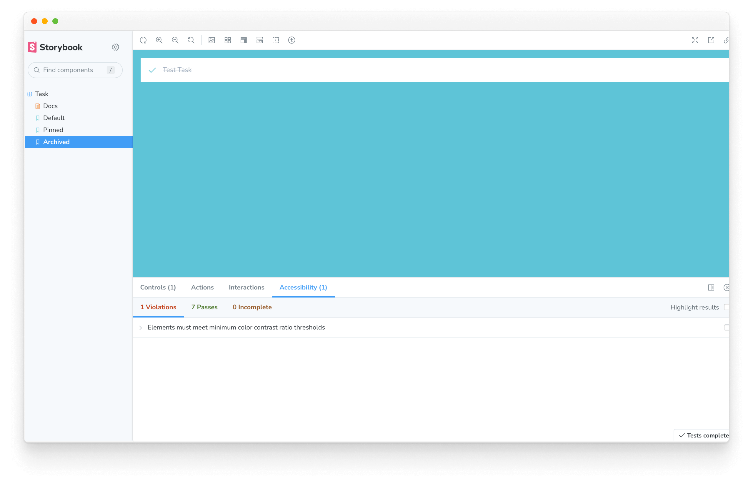
Cycling through our stories, we can see that the addon found an accessibility issue with one of our test states. The message "Elements must have sufficient color contrast" essentially means there isn't enough contrast between the task title and the background. We can quickly fix it by changing the text color to a darker gray in our application's CSS (located in src/index.css).
.list-item.TASK_ARCHIVED input[type="text"] {
- color: #a0aec0;
+ color: #4a5568;
  text-decoration: line-through;
}
That's it! We've taken the first step to ensure that UI becomes accessible. As we continue to add complexity to our application, we can repeat this process for all other components without needing to spin up additional tools or testing environments.