Why most design systems implode
We asked Brad Frost if design systems are still relevant in 2022?

Atomic Design by Brad Frost inspired frontend developers to create design systems. It shifted our focus from implementing UIs one page at a time to creating reusable, atomic components. Design systems went from "nice to have" to "must have".
But a majority of design systems ended up imploding. According to the 2021 Design Systems Survey, only 40% of the systems were successful. Why do some design systems succeed when most fail? I interviewed Brad to find out.
This post shares Brad’s design system pitfalls from seven years of experience teaching Atomic Design to folks at Nike, Techcrunch, Time magazine and more. We’ll dig into what does and doesn’t work:
- 🙅♂️ Not all engineers are made for design system work
- 🛠 Design system developers need custom tools
- 🐌 Design systems go stale fast
- 📕 How Brad Frost uses Storybook

Not all engineers are made for design systems
A design system is not an app frontend. A common pitfall is treating design systems like apps when they’re actually infrastructure. Design system developers have specific concerns like accessibility, composability, compatibility, and interoperability that impact multiple apps.
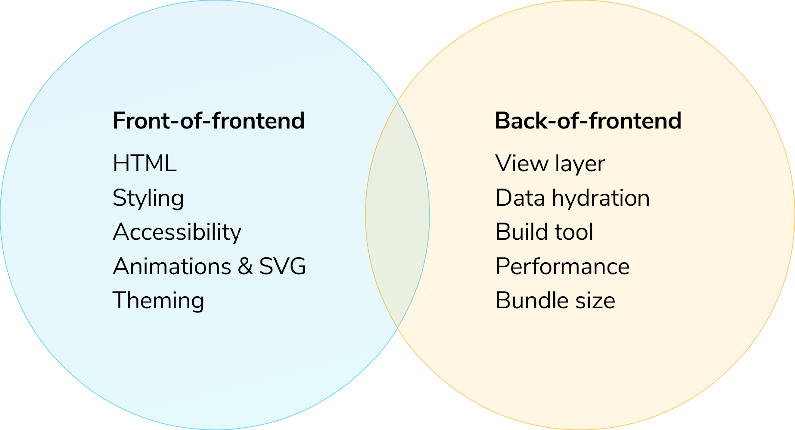
Not all engineers are made for design system work. The craft of frontend development is broader and more complex than ever. Over time, Brad witnessed frontend split into different interests:
- Front-of-frontend specializes in building UIs with HTML, CSS, and presentational JavaScript.
- Back-of-frontend writes JavaScript code to fetch data and manage application state and logic.
This split is essential for teams to understand their actual needs. Design systems focus on UI patterns, which means teams should prioritize front-of-frontend skills. Brad shares how shifting to front-of-frontend helped his clients move away from a culture of "we only hire full-stack developers" to assembling more balanced teams.

Design systems need custom tools
Design systems need specialized tools for developing reusable UI components in isolation. Most developers build UI components in the application where they're used. This unintentionally couples the UI to the app environment with implicit affordances like data-fetching, global configuration, and secrets. That makes it hard to reuse components.
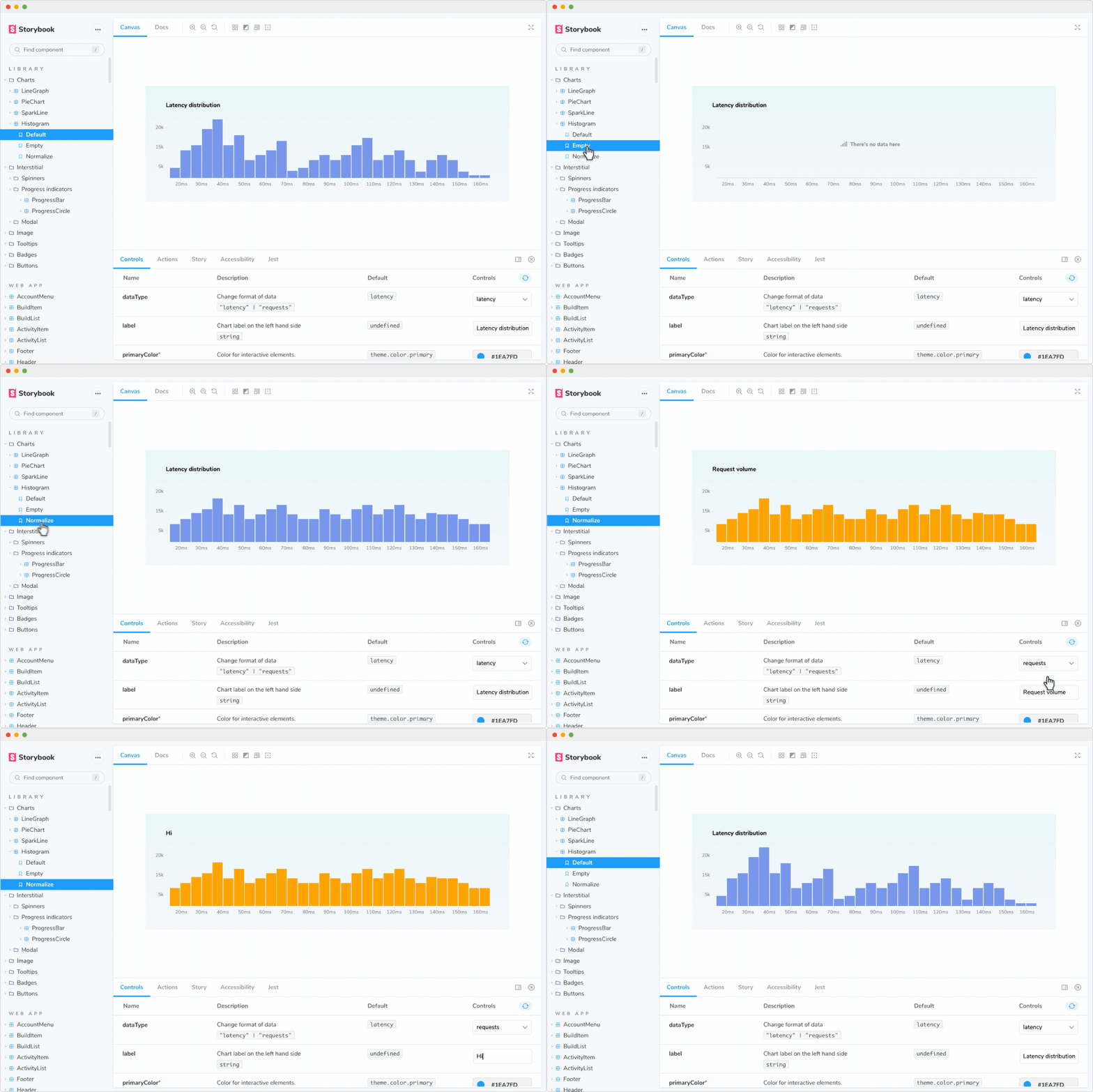
Brad recommends a frontend workshop like Storybook for building design systems. Frontend workshops help you isolate UI components from applications and render their variants by mocking props, data and context. This way can verify UI appearance and behavior without needing to spin up the app.
"For front-of-the-front-end developers, Storybook becomes the workshop environment where all UI code gets built."
Brad’s not alone in this idea. Tom Preston-Werner (co-founder of GitHub), describes why his team at RedwoodJS bundles Storybook into their framework:
"You can immediately see [when a component] is rendering wrong… You just go look at Storybook, and there are your iterations…"

Design systems go stale fast
Imagine the frustration of using a library with stale documentation. Brad points out stale documentation as the primary pitfall for design system teams:
"They treat [design systems] as this off-to-the-side thing… Chores suck, so teams eventually stop updating reference documentation. Once the documentation ceases to reflect the reality of the product, the effort is dead in the water."
If you could auto-generate documentation from code, that would ensure the production UI and docs stay in sync.
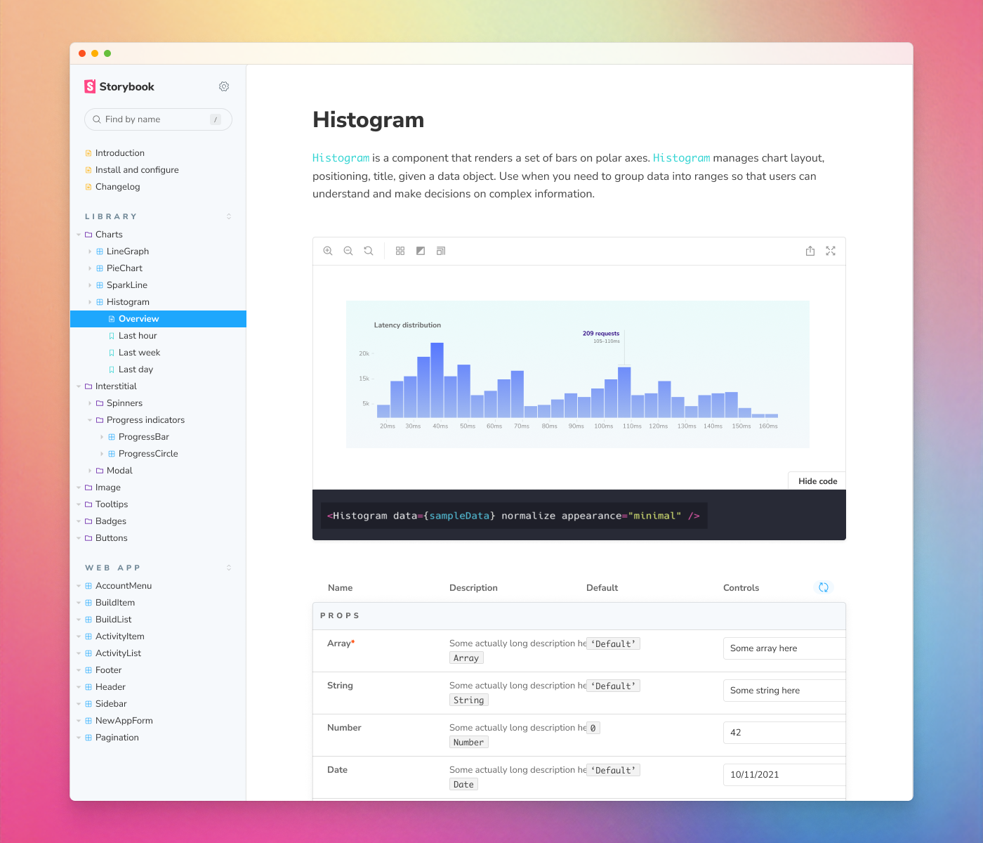
When you build components in Storybook, you naturally capture all their use cases as stories. Those stories can also be used to auto-generate interactive API documentation. What’s more, you can add more context by writing Markdown or embedding design assets.

How Brad Frost uses Storybook
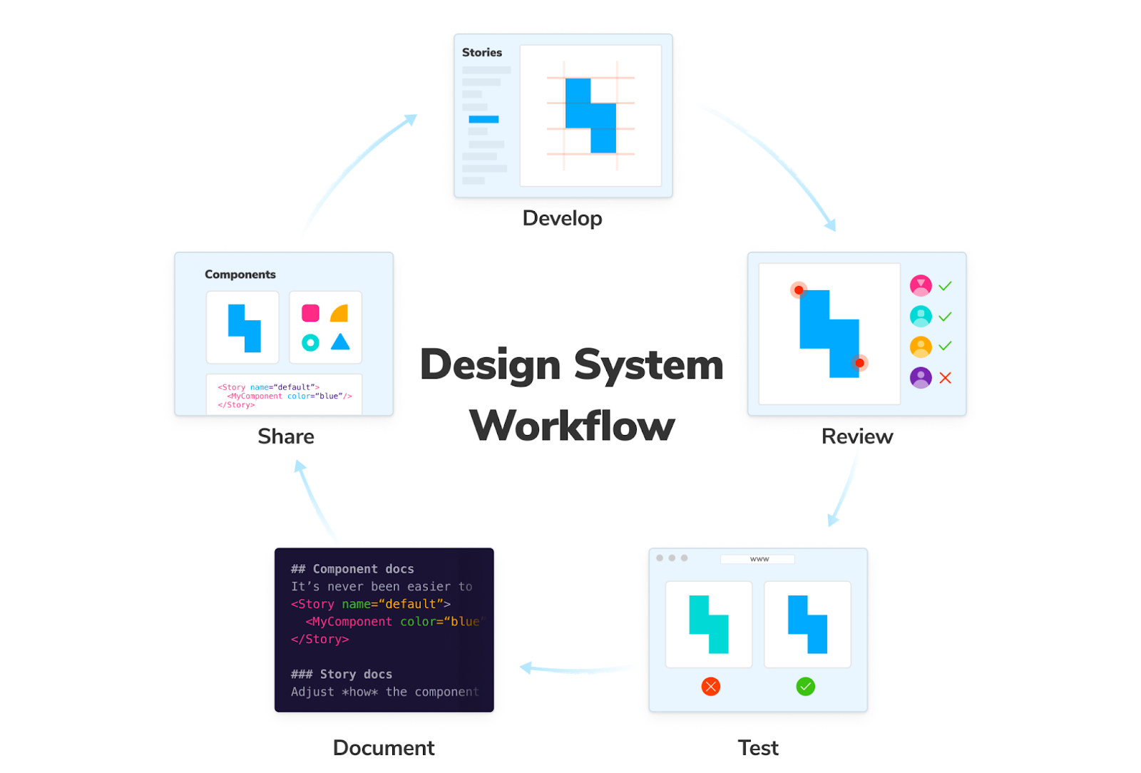
Brad builds every part of the UI from component to page in Storybook to “connect the dots between the design system and the products it serves”. This way, when a component in the design system is updated you can instantly verify its impact on your UI pages in Storybook. His workflow looks something like this:
- Develop component states and variants in a universal format called stories.
- Review them during development to verify appearance
- Test stories during QA with built-in testing for accessibility, interaction, visual regression
- Document components automatically and publish that documentation online
- Share components in other workflows like external sites, Figma, Notion

Storybook is loaded with essential addons for design systems that help you check alignment, spacing, and switch viewport dimensions. Wire up component props to graphical Controls to help teammates explore the component API. You can even import stories into other testing tools such as Jest, Puppeteer or Chromatic.
Testing has historically been really rough for us because it's like "picture in your mind's eye, a modal, and imagine clicking on a button that would happen to trigger that modal…"
[With] Storybook we could actually play this stuff out and recreate these clicks the way most users experience it — what a concept! And it checks out because it's all visual.
Conclusion
Design systems have penetrated the space between design and development. Brad's experience is a wonderful guide for teams to understand the skills and workflows required to produce high-quality design systems. Watch the full interview below:

Your team needs strong front-of-frontend engineering skills and the right tools. Frontend workshops offer an ideal environment for design systems by allowing you to focus on one UI component at a time. From there, generate documentation from components automatically so that your team’s docs don’t fall out of date.
Learn how to develop design systems
Check out our in-depth tutorial Design Systems for Developers. It's a free resource that shares how teams at Shopify, Auth0, Squarespace, and New York Times build world-class design systems in Storybook.
Why do most design systems implode?
— Storybook (@storybookjs) June 2, 2022
We did some digging and found out, with the help of @bradfrost (author of Atomic Design)
🙅♂️ Not all engineers are made for design system work
🛠 Design system developers need custom tools
🐌 Design systems go stale fast
🧵 pic.twitter.com/AxMCX6RvVW