Storybook 6.0
Production-grade component development

Storybook is the world’s favorite component workshop, widely adopted by industry giants, startups, and open source projects alike. It organizes components and their states to structure UI development, testing, and documentation for every major view layer.
The 6.0 release retools Storybook for professional frontend developers.
We researched leading teams at companies like BBC, IBM, Cisco, and Shopify. These teams have successfully scaled component libraries and pioneered their own best-practices.
The new Storybook incorporates these best practices so that all teams can benefit. What’s more, we removed boilerplate and configuration to streamline your developer experience. It includes:
- 💎 Essentials: Zero-configuration setup
- 🧬 Args: Next-generation, dynamic story format
- 🎛 Controls: Live edit component examples
- 🌐 Composition: Combine multiple Storybooks
- 📚 Documentation: Complete project overhaul
6.0 is almost fully backwards compatible with 5.X. Migration guide »
Our progress so far
Storybook is the de facto standard for building UI components. It enables structured UI development and documentation for every major framework.

📈 Record adoption. Storybook usage continues to grow, recently crossing 50,000 public repos and 7M npm downloads per month. We’ve seen especially high growth among the Vue, Angular, and Web Component communities.
👩💻 Thriving community. Storybook is one of the top 10 fastest growing OSS projects of 2019 according to GitHub. It recently passed 1000 contributors and 50,000 stars.
🧪 Platform innovation. We’ve successfully launched several core platform changes while ensuring stability for our users. Notably, Component Story Format is a portable standard for component examples. Storybook Docs powers countless production design systems including our own.
Essentials: zero-config setup
Zero-config setup is one of the most requested features by advanced users. Leading teams who benefit from Storybook’s configurability also want us to “simplify” setup. That’s because they want other teams inside their company to also use Storybook. A powerful zero-config setup makes adopting UI components easier.

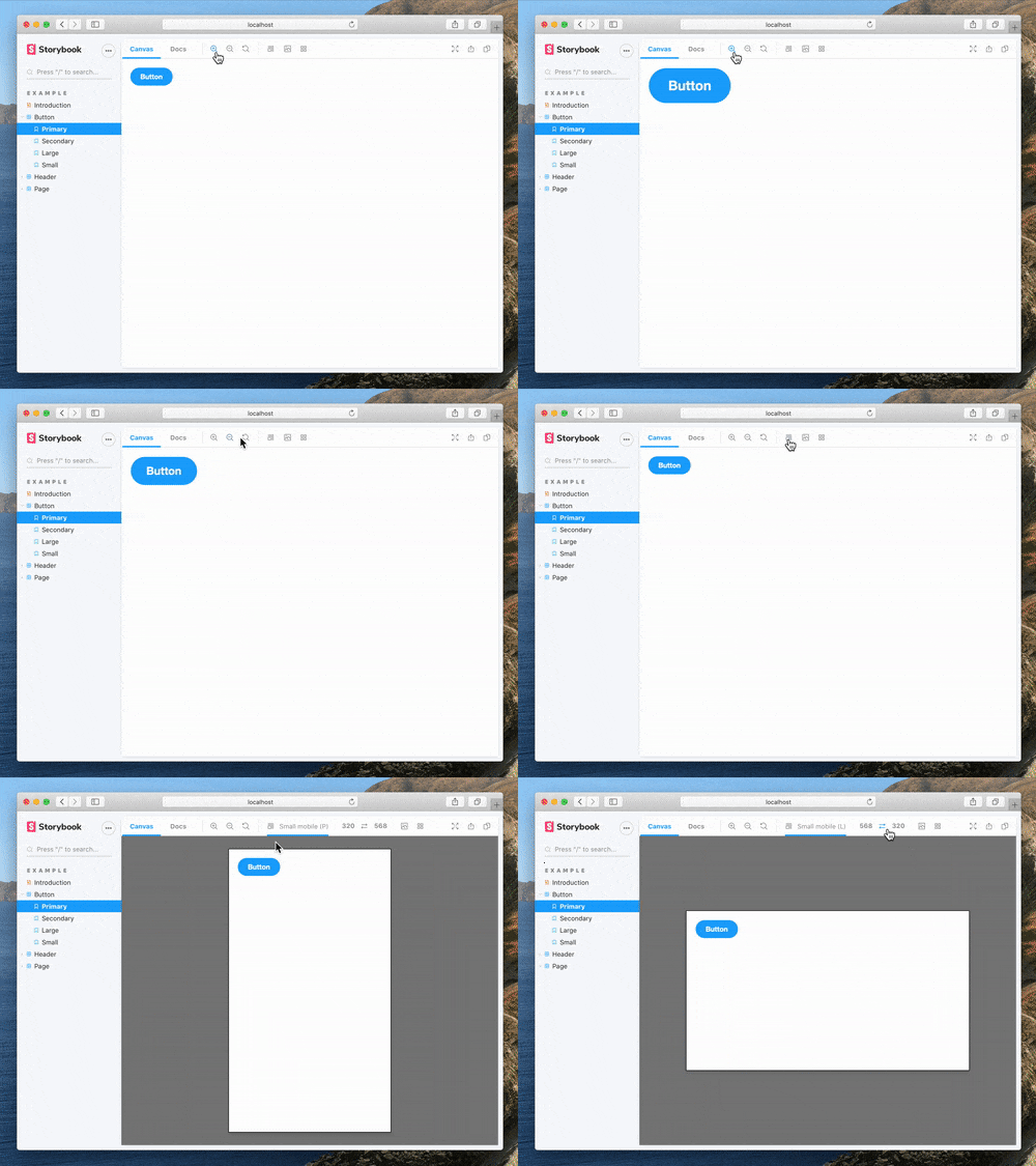
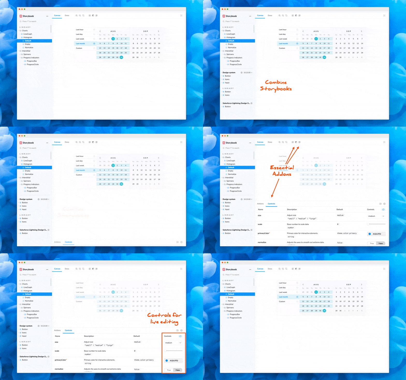
Storybook 6.0 comes with best practice features pre-configured. These features were previously available as addons. Now these Essential addons have been tuned, documented, and shipped with Storybook. Furthermore, TypeScript support is built in, so you don’t have to worry about that either.
To learn more, read the post: 👉 Zero-config Storybook »
Args: next-gen story format

The second thing you’ll notice about 6.0 is an optional new story construct, Args, which sits at the core of the developer experience:
export const Basic = (args) => <Button {...args} />;
Basic.args = { label: 'hello' };
Serious Storybook users write hundreds or even thousands of stories. They want more ways to make that investment pay off with portability, reuse, and value-added features.
Storybook Args are a foundational change to writing stories. As a user, you can now declare the inputs to your stories “args” and the initial values. Storybook and its addons will then dynamically modify the args, enabling things like auto-generated controls, auto-generated actions for event logging, and even custom toolbars.
Args also have ergonomic benefits, allowing you to:
- 🗜 Reduce size and complexity of stories
- 🚚 Reuse fixture data across stories
- ♻️ Recycle stories in a broader variety of tools
To learn more, read the post: 👉 Introducing Storybook Args »
Controls: live editing with no code
One of the first features to benefit from Storybook Args is Controls, a new addon, requested by countless developers, that allows you to dynamically edit a component’s inputs without touching code. Controls are auto-generated UI for rapid component experimentation.
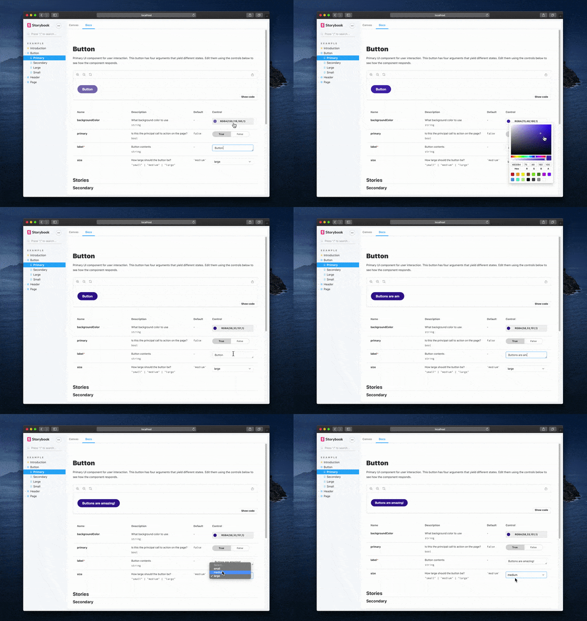
If you’re familiar with Storybook this may look similar to Knobs, the addon it supersedes. But that similarity is only skin deep. Because controls are auto-generated, there’s no extra code to write, and no maintenance needed as you modify APIs. Controls code is also more portable because it doesn’t depend on Storybook-specific APIs.
The Controls addon is a win for professional developers: not only is it easier to explore new component states yourself, but your Storybooks are instantly more accessible to non-technical teammates for feedback.
To learn more, read the post: 👉 Storybook Controls »
Composition: combine Storybooks
One of the most exciting features in Storybook 6 is Composition: the ability to browse components from any Storybook inside your local Storybook.
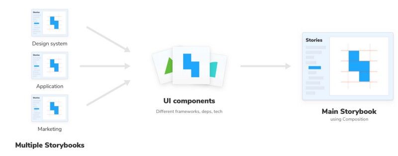
This feature was requested by teams at IBM, Cisco, and Chromatic who manage large UI efforts where it’s useful to aggregate distributed projects.
Composition also unlocks new use cases. For example, it’s now possible to develop a cross-framework design system in React, Vue, and Angular in a single composed Storybook. It also makes it possible browse design system docs alongside your application screens as you develop them in storybook.
To learn more, read the post: 👉 Storybook Composition ».
Documentation overhaul
A final request — made by Betterment and almost every team we talked to — was better documentation for Storybook itself. Even heavily invested teams with deep Storybook expertise listed this as one of their key pain points.
We listened, and we’ve completely redesigned and rewritten Storybook’s documentation from the ground up:
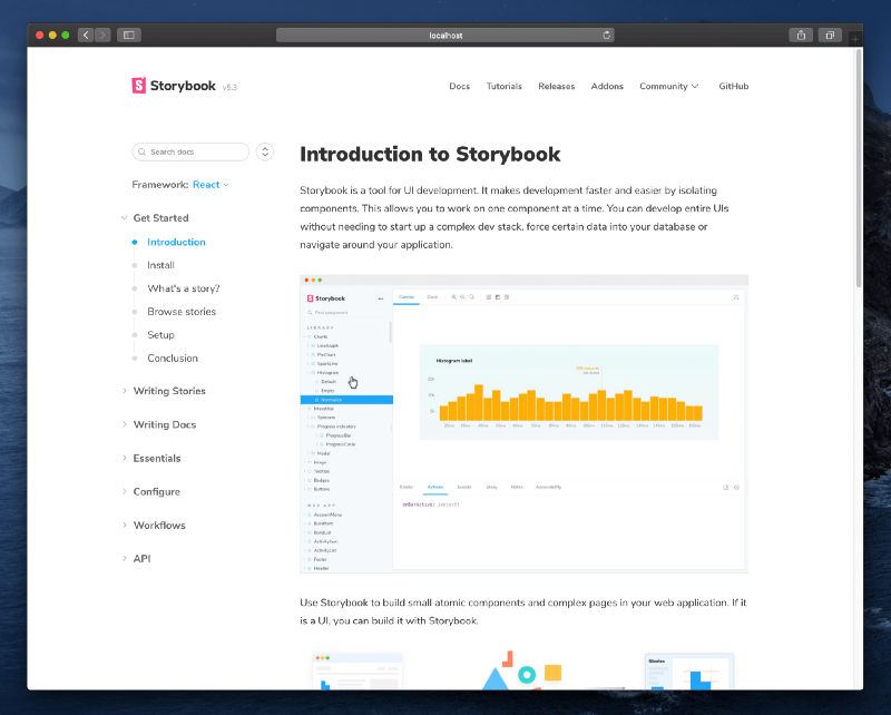
Led by the editors of Learn Storybook, Dominic Nguyen and Tom Coleman, it’s the well-written, comprehensive Storybook reference you’ve always wanted.
To learn more, check out the site: 👉 Storybook Documentation »
Hundreds more improvements
In addition to the major changes, we evolved existing features and fixed hundreds of bugs. A few highlights include:
- Layout parameter. Built-in padded/fullscreen/centered stories.
- Stylized story sort. Specify a function or section order for easy sorting.
- Dynamic source snippets. Render JSX with live control values in React.
- Version release notes. See what’s new after you’ve upgraded.
- Yarn 2. Support for next-generation package management.
For a comprehensive list see: 👉 CHANGELOG.md »
1 minute install
To give these features a try, upgrade an existing project to Storybook 6.0:
npx sb upgradeIn most cases this is enough to get you up and running with the new version. But if you’re stuck, we’ve got you covered.
For a full walkthrough see: 👉 Storybook 6 Migration Guide »
Alternatively, for a fresh install, bootstrap Storybook into an existing app:
npx sb initYou’ll get a full 6.0 config out of the box, including everything described in this post, plus a beautiful new onboarding experience for new users.
Get involved
Storybook 6.0 is brought to you by the following contributors:
@adamborowski @ajkl2533 @amannn @andre-brdoch @asudoh @atanasster @brandonseydel @cavanwagg @chrisj-skinner @christianwiedemann @cpgruber @daniel-ac-martin @domyen @eric-hc @fernandopasik @fjorgemota @frassinier @fred-el-jolo @gaetanmaisse @ghengeveld @graup @hipstersmoothie @hypnosphi @igor-dv @isaacplmann @john015 @johnalbin @jonspalmer @jorisw @kdnk @kevin940726 @kruthivijay31 @kylesuss @lifeiscontent @luke-j @marcobiedermann @markhuot @marklb @marklyck @matheo @matus12 @mbelsky @mdchristians @mkamranhamid @mrmckeb @nad182 @nanoblit @ndelangen @niedzielski @okovpashko @orpheusp @papistan @pyrolistical @rek @sarioglu @sean-codes @sekiya9311 @shilman @skovy @tmeasday @tomastomaslol @tooppaaa @vvanpo @wormwlrm @yannbf
The project is maintained by 1000+ open source contributors and guided by a steering committee of top maintainers. If you are interested in contributing, check out Storybook on GitHub, create an issue, or submit a pull request. Donate on Open Collective. Chat with us in Discord — a maintainer is usually online.
Stay up to date with Storybook news on Twitter and by signing up for our official mailing list.