Storybook Addon Responsive Columns
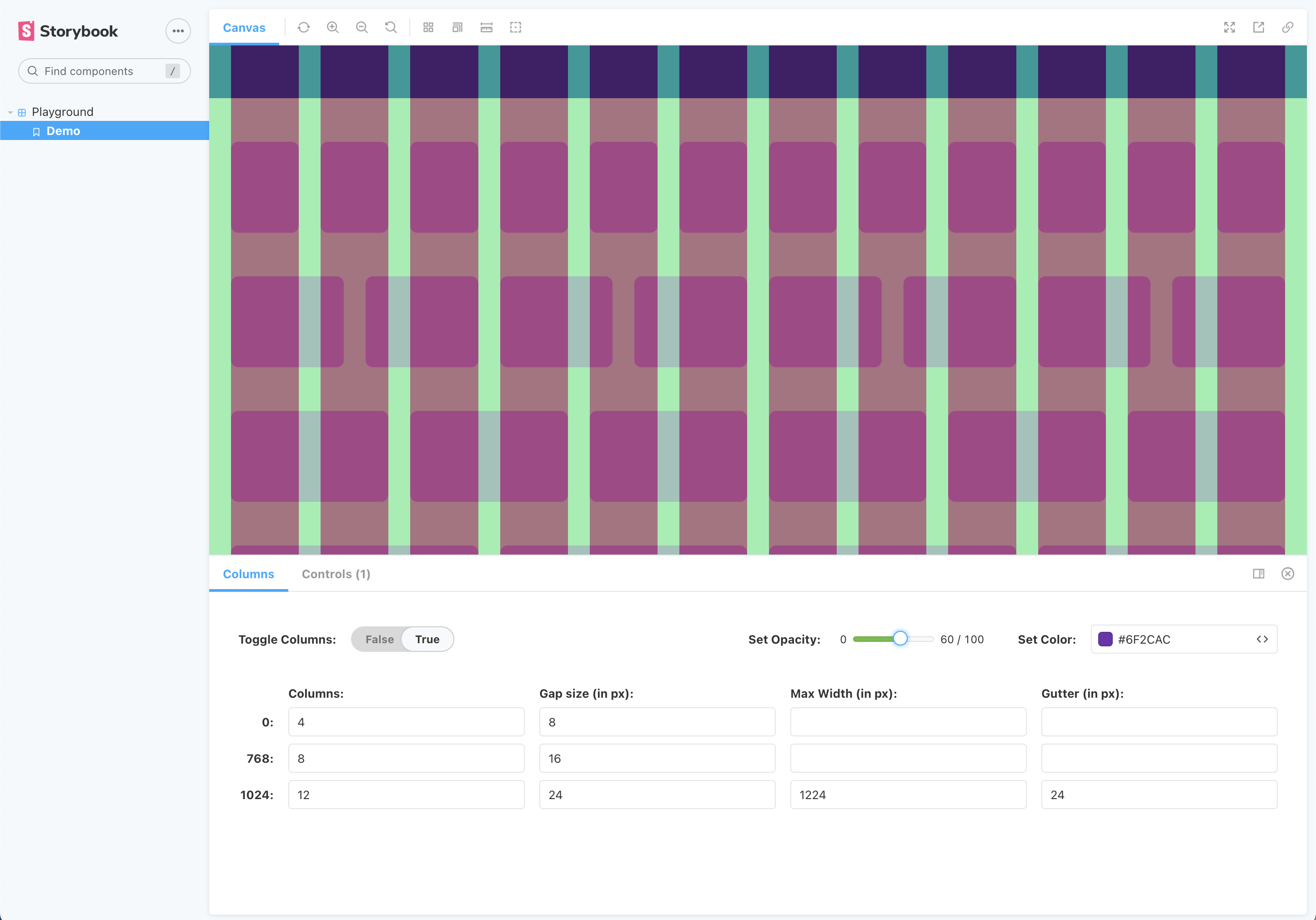
A responsive, grid-based columns overlay. Define your grids using either global or local parameters, and tweak your grid properties using Columns controls panel.
View an interactive demo.

Installation
yarn add -D storybook-addon-responsive-columns
within .storybook/main.js:
module.exports = {
  addons: ['storybook-addon-responsive-columns'],
};
Usage
storybook-addon-responsive-columns comes with some defaults to get you started.
| Property | Default | Type |
|---|---|---|
| active | false | boolean |
| gridColor | tomato | string |
| opacity | 30 | number |
| breakpoints | see here | object[] |
If you'd like to use custom parameters, you can do so globally using the columns key in ./storybook/preview.js:
export const parameters = {
  columns: {
    active: true,
    gridColor: "salmon",
    opacity: 30,
    breakpoints: [
      {
        breakpoint: 0,
        columns: 4,
        gap: 8,
      },
      {
        breakpoint: 768,
        columns: 8,
        gap: 16,
      },
      {
        breakpoint: 1024,
        columns: 12,
        gap: 16,
        maxWidth: 1224,
        gutter: 24,
      },
    ],
  },
};
or locally by adding columns to the parameters key in your story's metadata:
export default {
  parameters: {
    columns: {
      ...
    },
  },
};
Made by
- adamfratino
Work with
Angular
Ember
HTML
Preact
React
React native
Svelte
Vue
Web Components
Tags