Sass button components
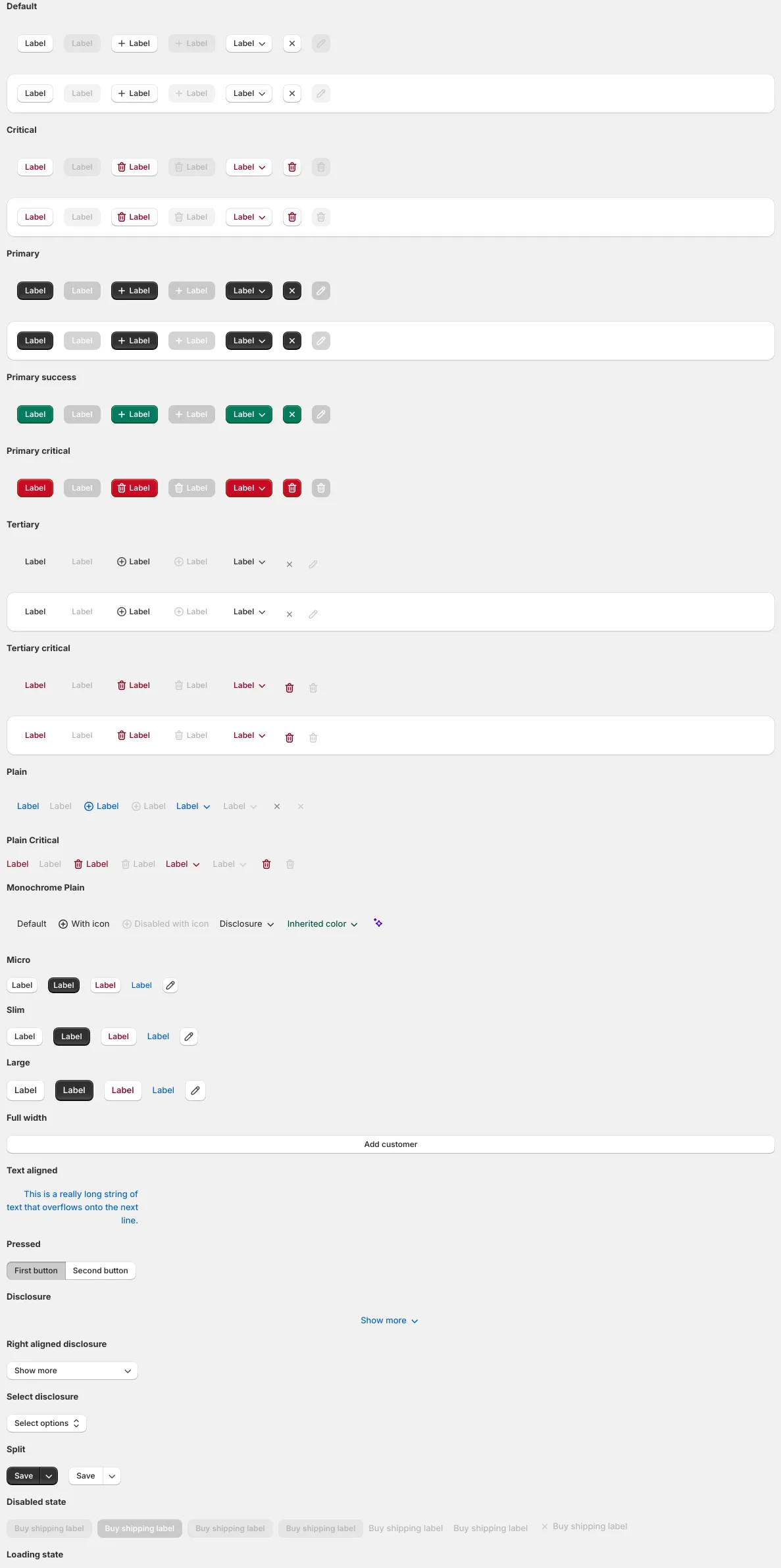
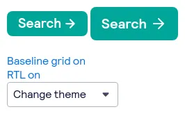
49 buttons are styled using Sass. A button is a clickable interactive element that triggers a response. You can place text and icons inside of a button. Buttons are often used for form submissions and to toggle elements into view. Sass is a styling format that is compiled into CSS. It extends CSS with advanced features like scripting, mixins, and nesting. Sass is used to style 16 projects.
49components231storiesLast updated yesterday

Button

button

Button


